v5.0 launch sale - limited time offer!
Tailkit's web application is a joy to use.
Use it to preview all available components and copy them with a single click. Use it to get access to all available templates and tools. Use it customize your experience. Use it to build your next masterpiece.
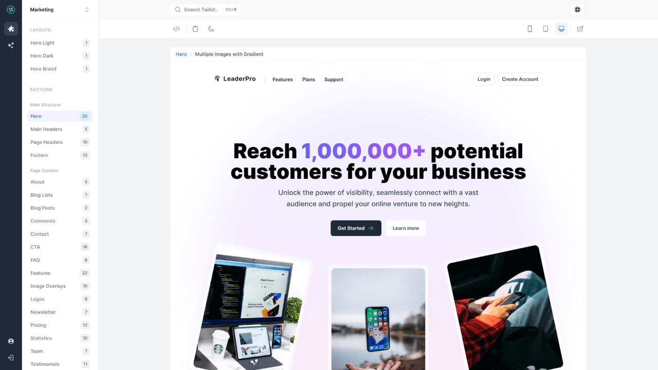
Preview Pane
Meet the handiest feature you’ll be using! Each available Tailwind component can be previewed and handled through our custom coded pane. It comes packed with amazing features.
Customize your experience.
Ready to make Tailkit truly yours? Dive in and tweak everything from layouts to tech preferences. It's like having a digital playground designed just for you.
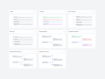
Components category view
You can set the category view preference for the UI components. You can preview them in a 3 column grid, a single column list or even a single column list with preview pane enabled for each UI component.
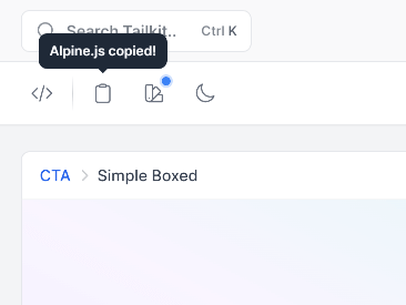
Default tech to copy
You can select the technology (HTML, React, Vue.js and Alpine.js) that you want to copy by default when you are using the copy component button in each Preview Pane.
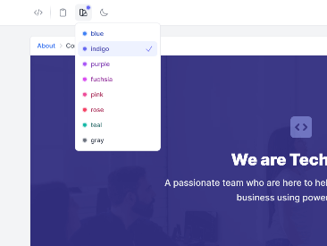
Color editorNew colors added! 🎉
The primary color, used in all Tailwind components, is blue but you can change it to any of the 10 available colors to match your preferences. You can also change the secondary color to any of the 5 available gray shades (gray, slate, zinc, neutral, stone).
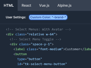
Custom color class namesNew!
If you are using your own primary or secondary colors (gray shades) with all default shades (50-950), you can change their names in all code snippets to match your CSS configuration.
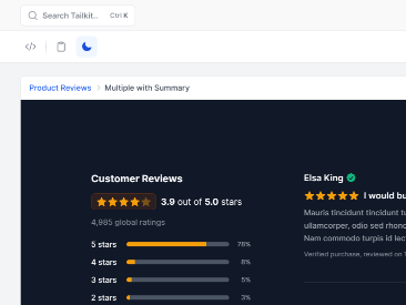
Dark mode preference
You can set dark mode to be the default mode in the preview pane. This way, you will always preview the dark version of each component. Set it to Universal, to let it auto change based on Tailkit's app preference.
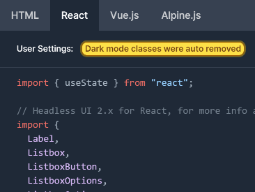
Remove dark mode classesNew!
Not planning to use dark mode in your project? No worries! With just one click, you can effortlessly remove all dark mode classes by default.
It comes with features you will love using.
Beautiful and fully responsive design which comes with dark mode support, global search to easily find what you are looking for and a User Interface fast as a rocket.
Beautiful design.
Elegant and intuitive interface that enhances your workflow without overwhelming you.
Fully responsive
Intuitive navigation
Consistent design language
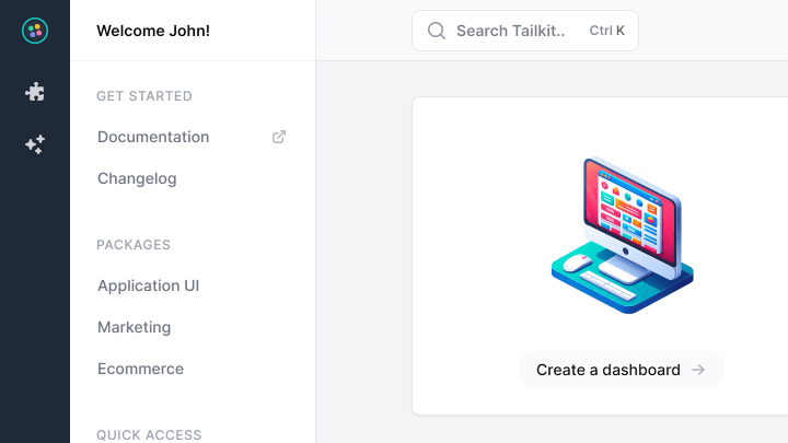
Dark mode.
Embrace the dark side or bask in the light. Work in the dark or light mode. It's your call.
Reduced eye strain
Auto system preference detection
Remembers your preference
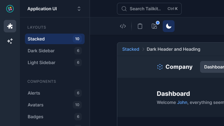
Global search.
Find anything instantly with our powerful and intuitive search functionality.
Instant results
Search across all main sections
Trigger with a shortcut
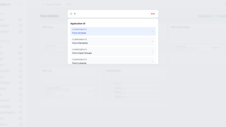
Super fast.
Do more in less time. Experience lightning-quick responsiveness with our optimized UI.
Instant page transitions
Optimized for performance
CDN powered assets
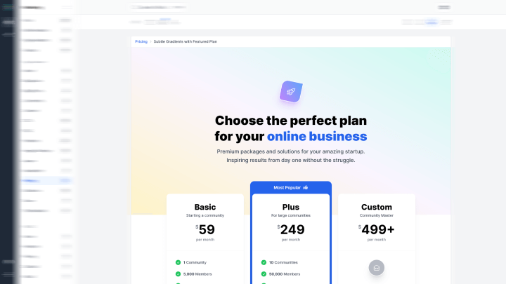
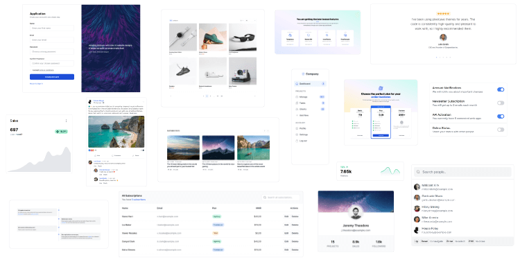
2,000+ handcrafted snippets.
Now in your AI editor.
Build modern web apps and websites with Tailkit's huge collection of Tailwind components, templates and tools. Now available through our MCP Server.