v5.0 launch sale - limited time offer!
Tailwind CSS Dropdowns
There are 4 available components in this category, preview them all!
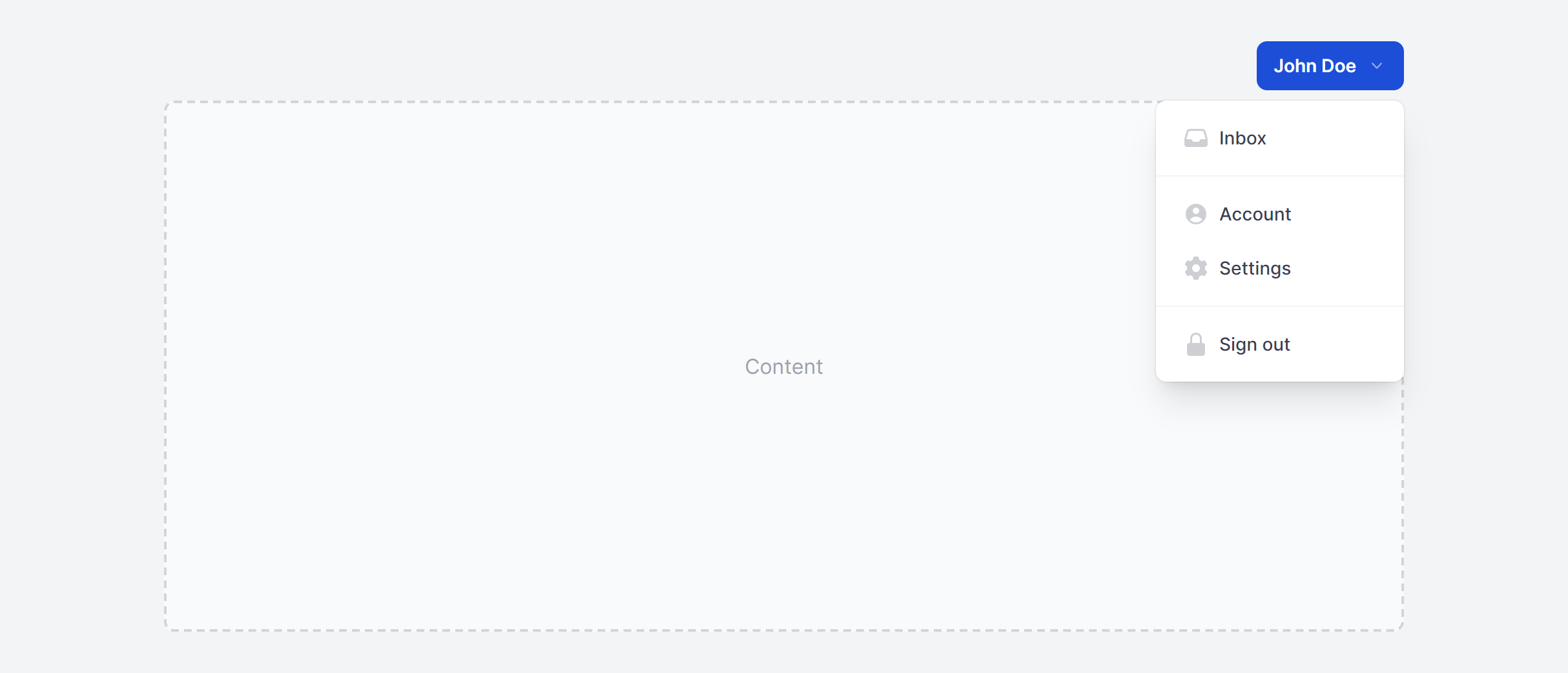
Simple
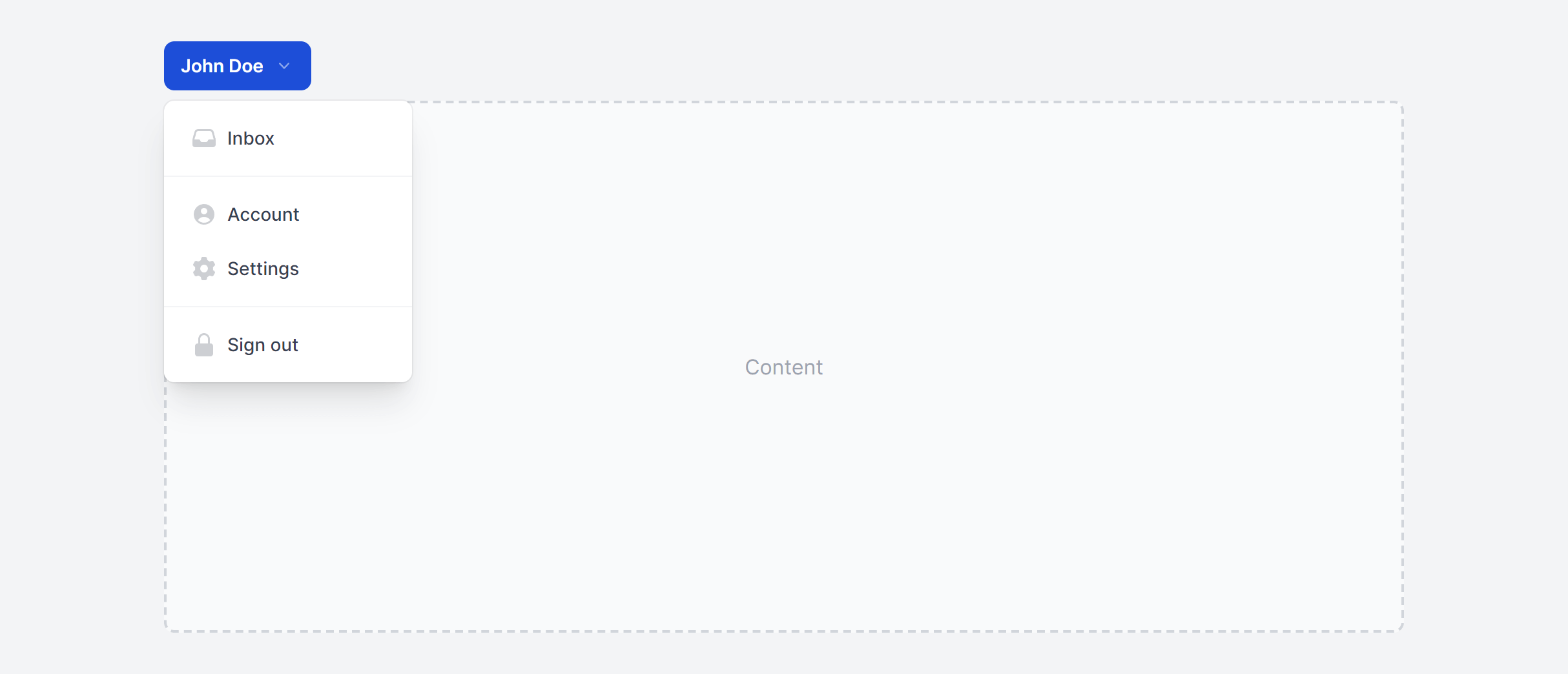
Simple Left
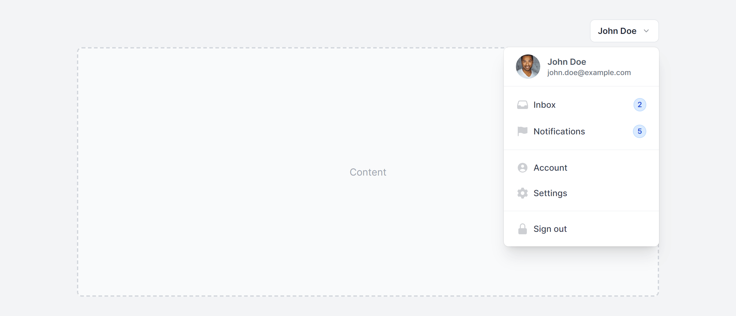
With Header and Badges
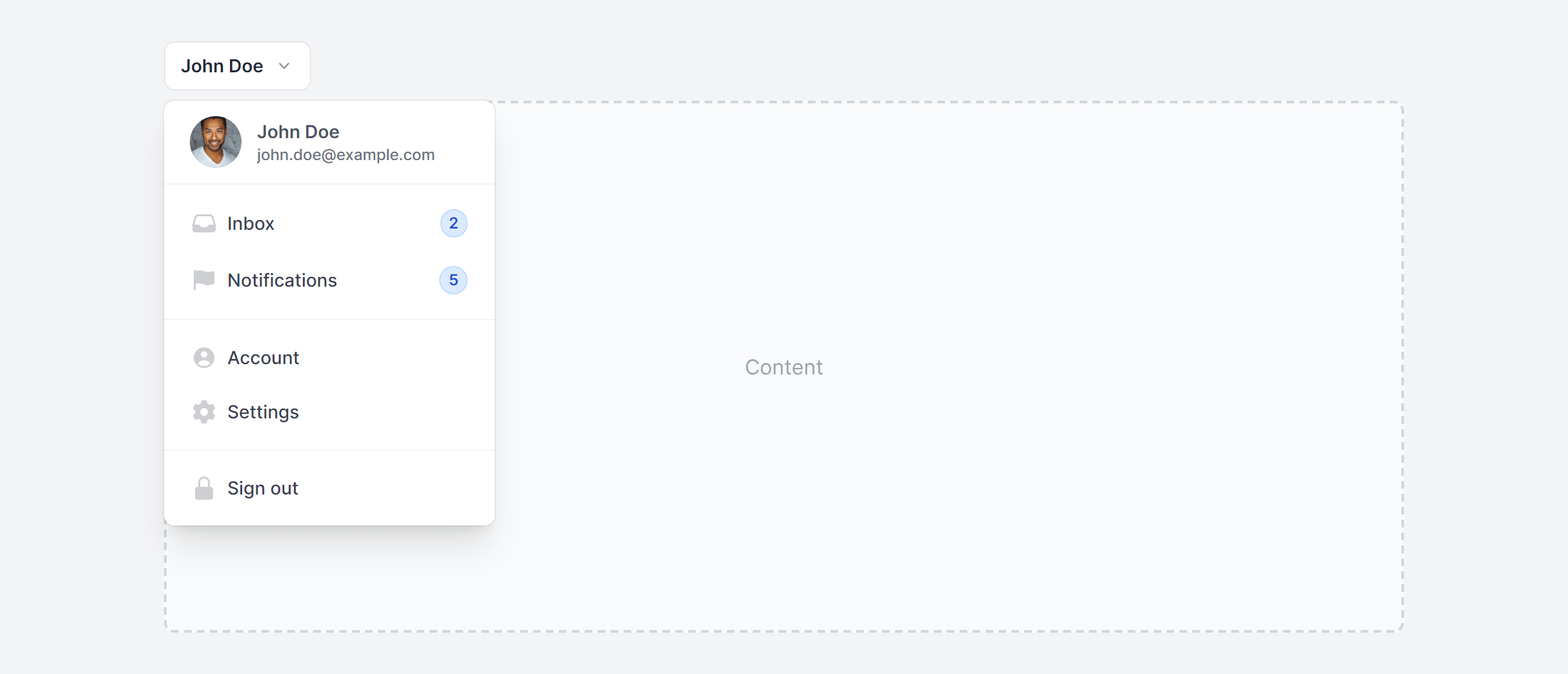
With Header and Badges Left
Frequently Asked Questions
Let’s have a better look into Tailwind CSS Dropdowns.
Can I include form elements like checkboxes inside a dropdown?
Yes. Dropdowns work well for multi-select filter patterns where each option has a checkbox. The key difference from a standard action menu: don't close the dropdown on item click, since users need to select multiple options. Add an "Apply" or "Done" button at the bottom, or apply filter changes in real time as checkboxes toggle.
How do I handle dropdowns in a scrollable table or container?
If the dropdown's parent has overflow: hidden or overflow: auto, the menu will get clipped. The fix is to render the dropdown menu via a portal (React portal, Vue Teleport, or appending to document.body) so it's positioned relative to the viewport rather than a scrollable ancestor.
What is the difference between a dropdown and a select menu?
A dropdown (role="menu") is for actions: edit, delete, duplicate, share. A select menu is for choosing a value within a form: country, status, category. They look similar but serve different purposes. Use native <select> elements or custom select components (available separately in this library) for form inputs, and dropdown menus for action lists.

2,000+ handcrafted snippets.
Now in your AI editor.
Build modern web apps and websites with Tailkit's huge collection of Tailwind components, templates and tools. Now available through our MCP Server.