v5.0 launch sale - limited time offer!
Tailwind CSS Blog Lists
There are 7 available components in this category, preview them all!
Full Width
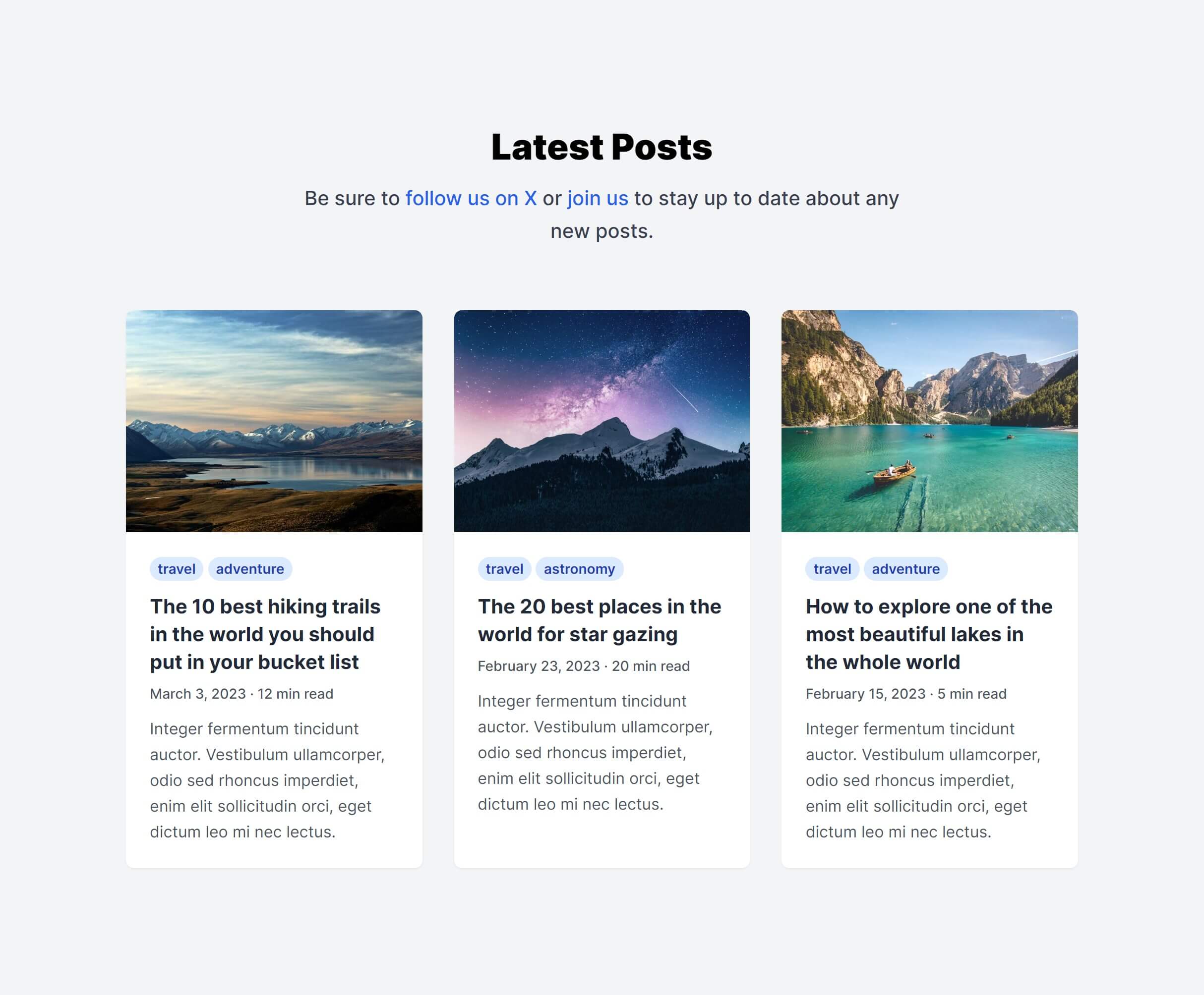
In Grid
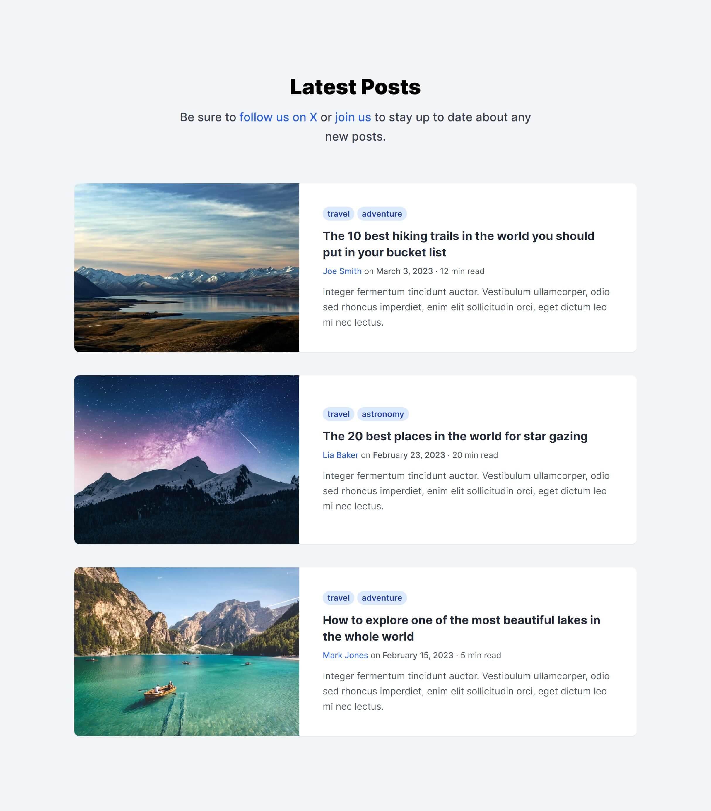
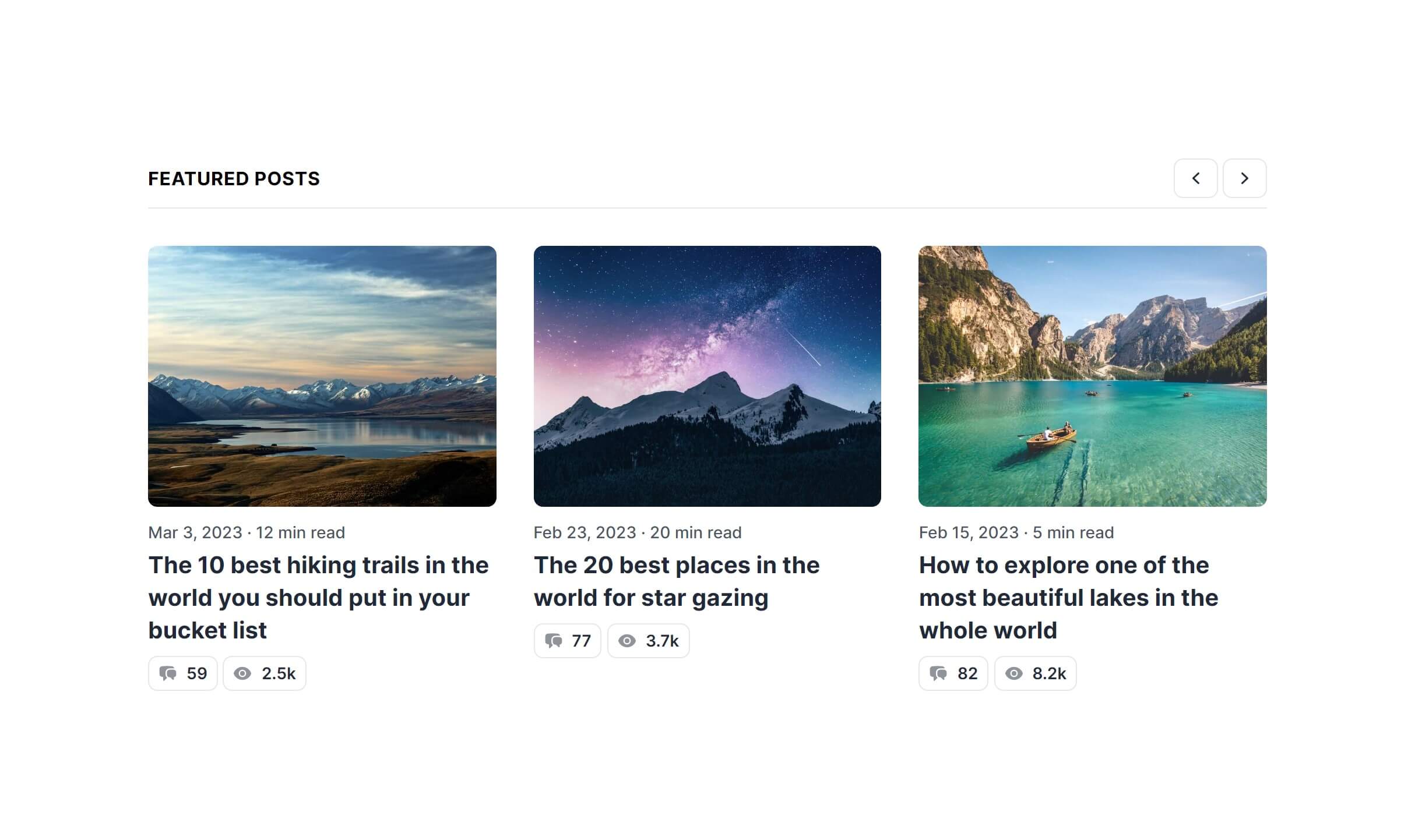
Featured Posts
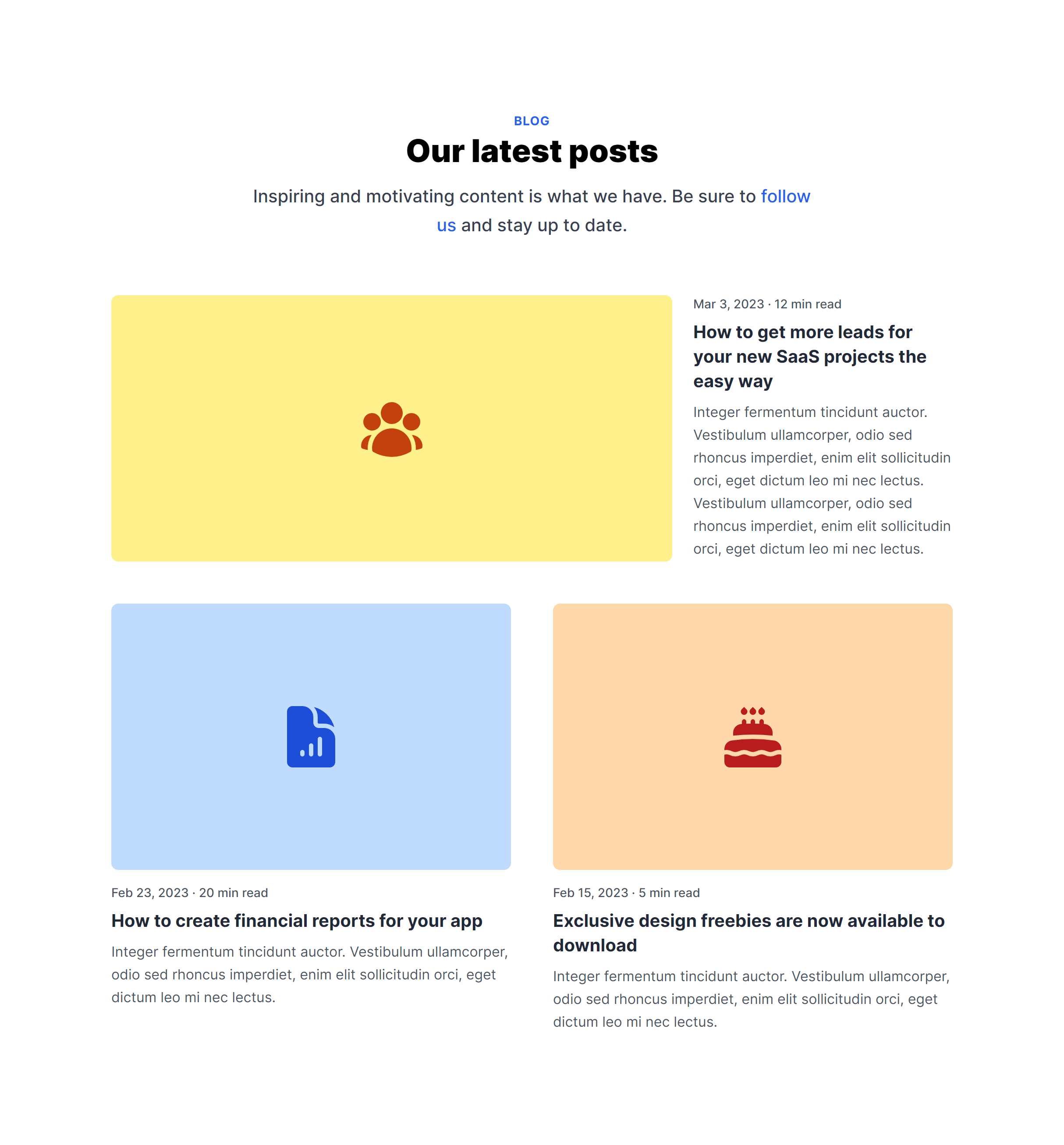
Modern Grid
Simple
Simple with Authors
In Grid Alternate
Frequently Asked Questions
Let’s have a better look into Tailwind CSS Blog Lists.
How do I populate blog cards with dynamic content?
Replace the placeholder content with your actual post data. In React, Vue or Alpine.js, map over your posts array and render a card for each entry. In plain HTML, duplicate the card markup per post. The key fields to update are the title, excerpt, featured image, date, author, and link URL.
What image aspect ratio works best for blog cards?
Most card layouts use a 4:3 ratio for featured images. Tailwind's aspect-video or aspect-4/3 utilities enforce consistent sizing regardless of source image dimensions. Use object-cover on the image to prevent distortion, and serve images at 600-800px wide for card thumbnails.
2,000+ handcrafted snippets.
Now in your AI editor.
Build modern web apps and websites with Tailkit's huge collection of Tailwind components, templates and tools. Now available through our MCP Server.