v5.0 launch sale - limited time offer!
Tailwind CSS Calendars
There are 6 available components in this category, preview them all!
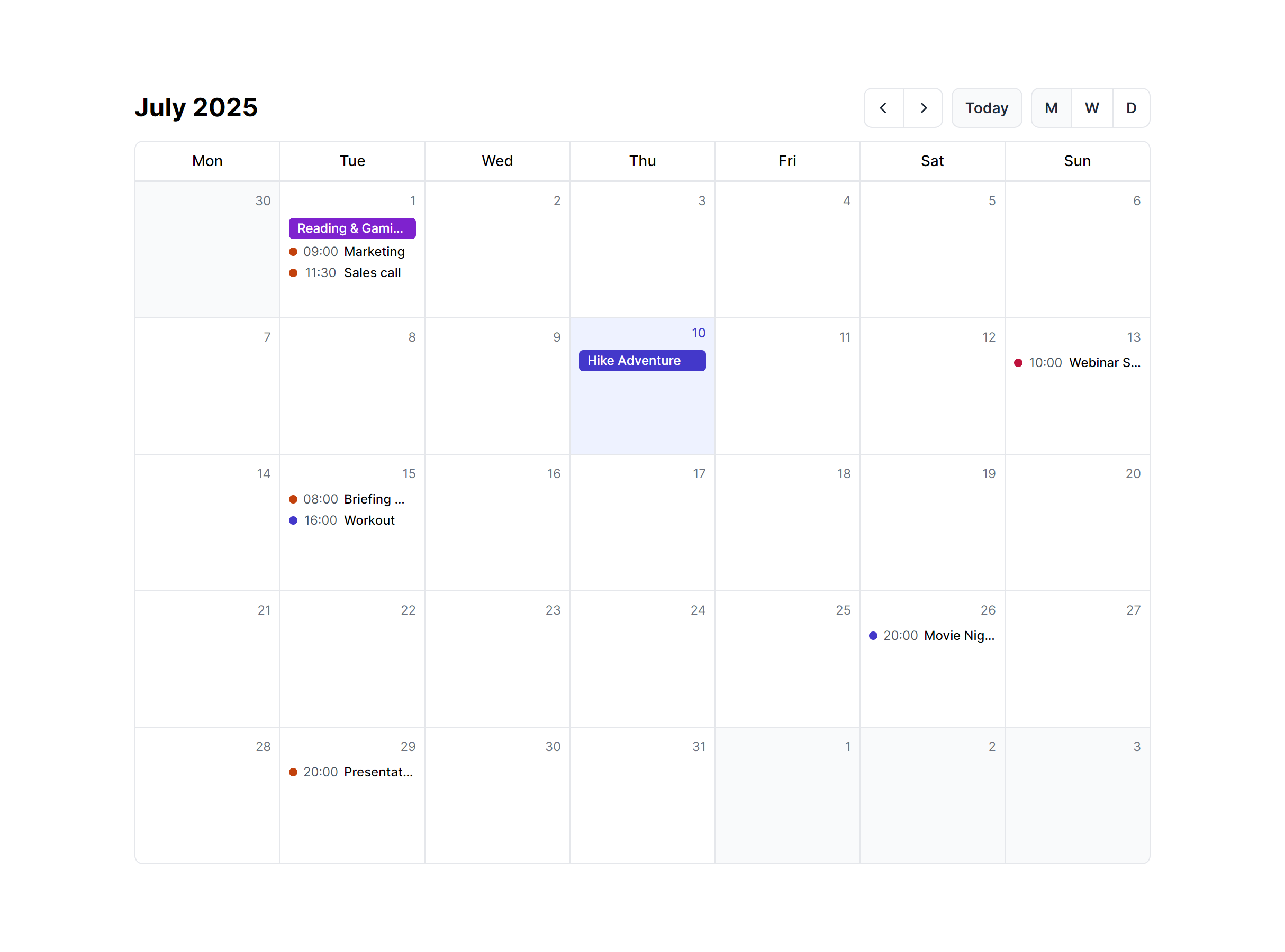
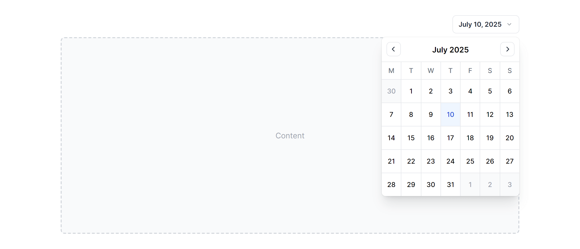
Month View
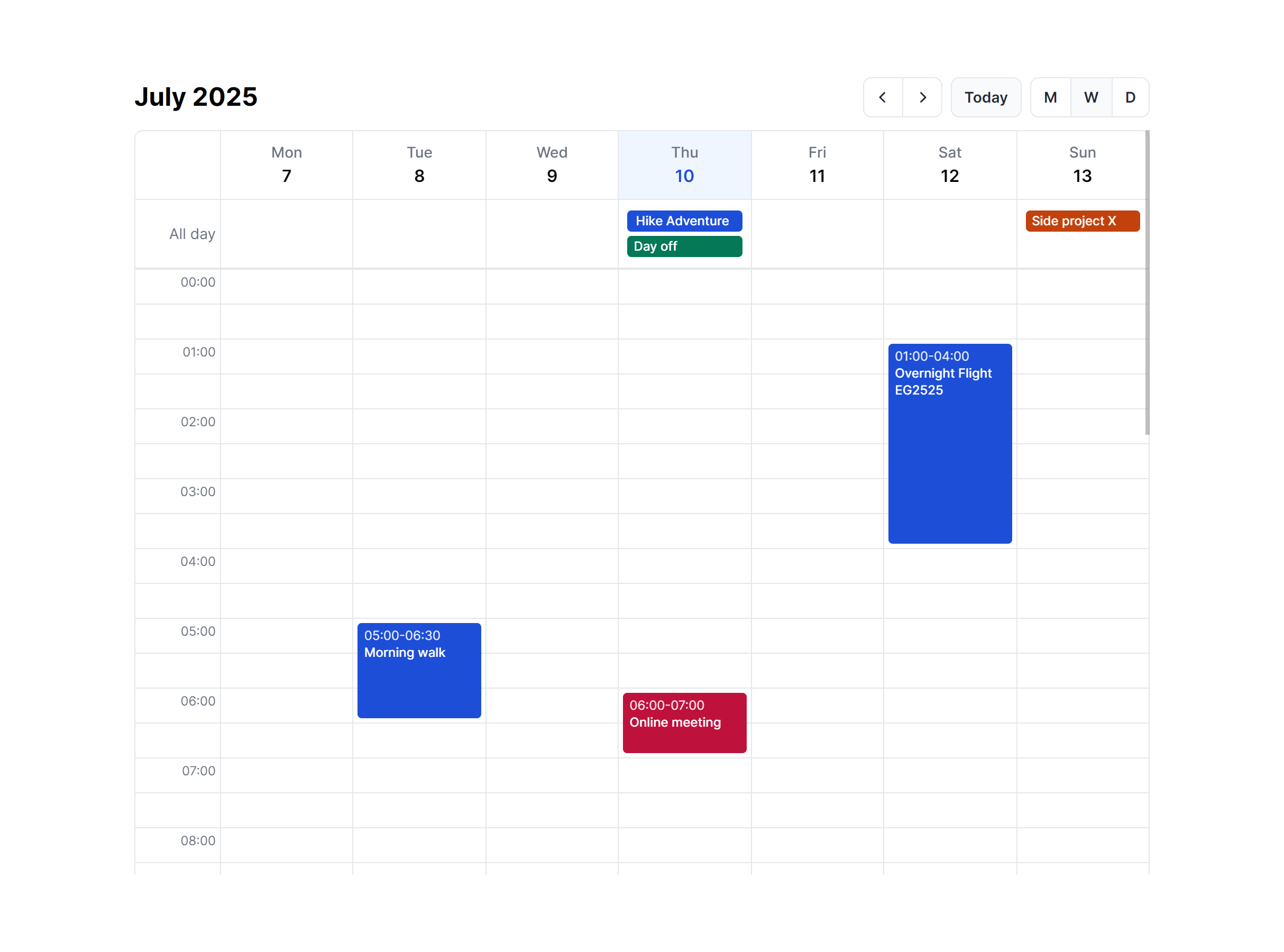
Week View
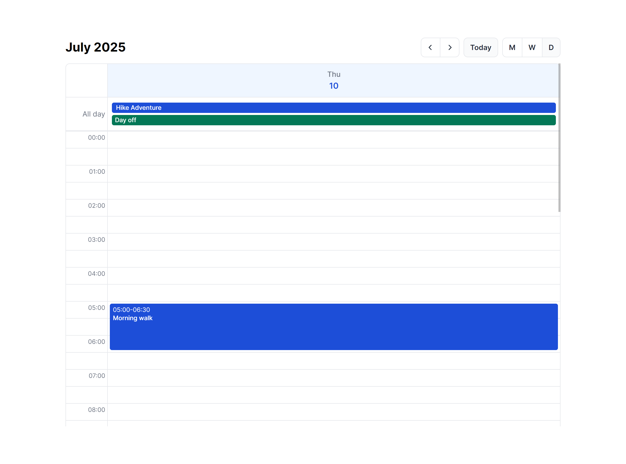
Day View
Month View Compact

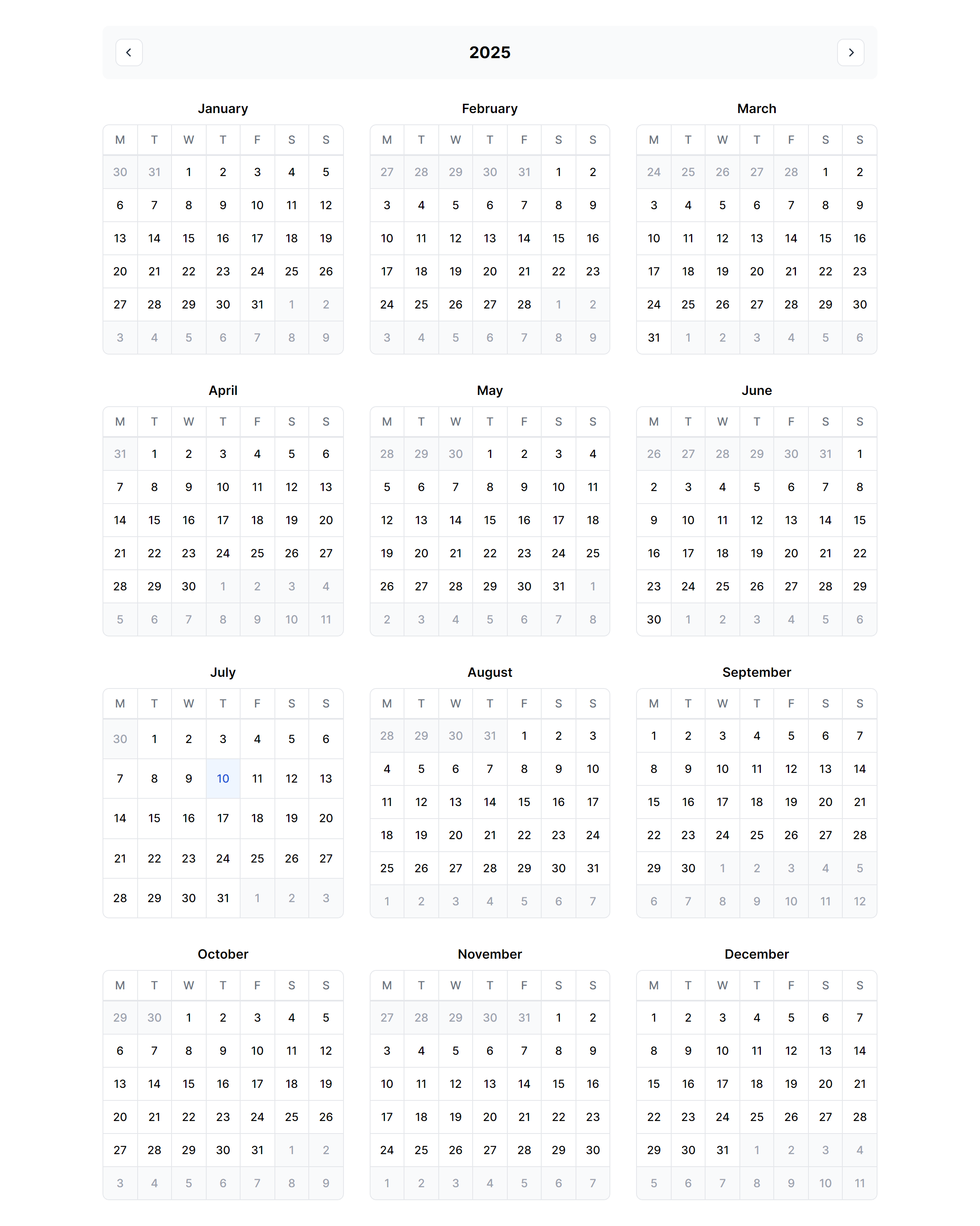
Year View
In Dropdown
Frequently Asked Questions
Let’s have a better look into Tailwind CSS Calendars.
How do I switch between month, week, day, and year views?
These components provide the visual layouts for each view type. You'll need to implement the view switching logic yourself, typically with a state variable that determines which component to render. The month view shows a full grid, the week view displays seven columns with hourly rows, the day view focuses on a single date with detailed time slots, and the year view presents a compact twelve-month overview.
Can I use the compact calendar variant as a date picker?
Yes. The compact variant is designed specifically for inline date selection scenarios. It renders a minimal month grid without the full event display features, making it ideal for forms, filters, or any interface where you need users to pick a date without the visual weight of a full calendar view. Pair it with your date selection logic to capture user input.
2,000+ handcrafted snippets.
Now in your AI editor.
Build modern web apps and websites with Tailkit's huge collection of Tailwind components, templates and tools. Now available through our MCP Server.