v5.0 launch sale - limited time offer!
Tailwind CSS Logos
There are 9 available components in this category, preview them all!
Plain
With Dividers
Simple
Simple Boxed
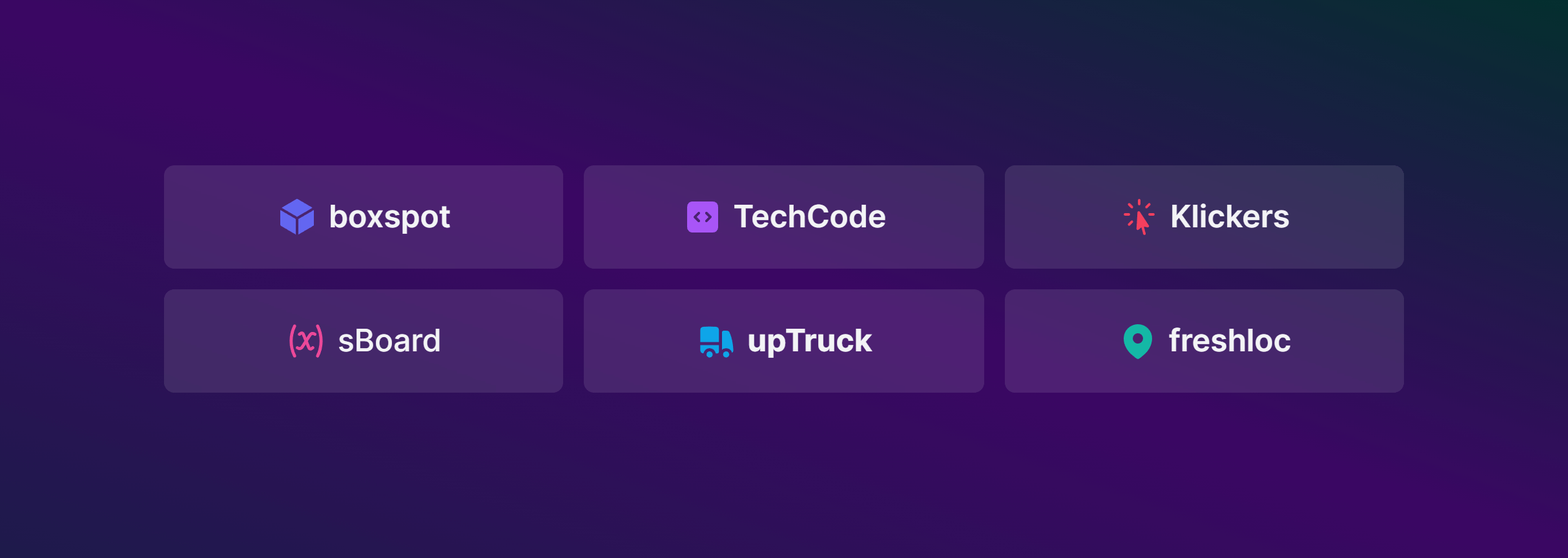
Dark Boxed
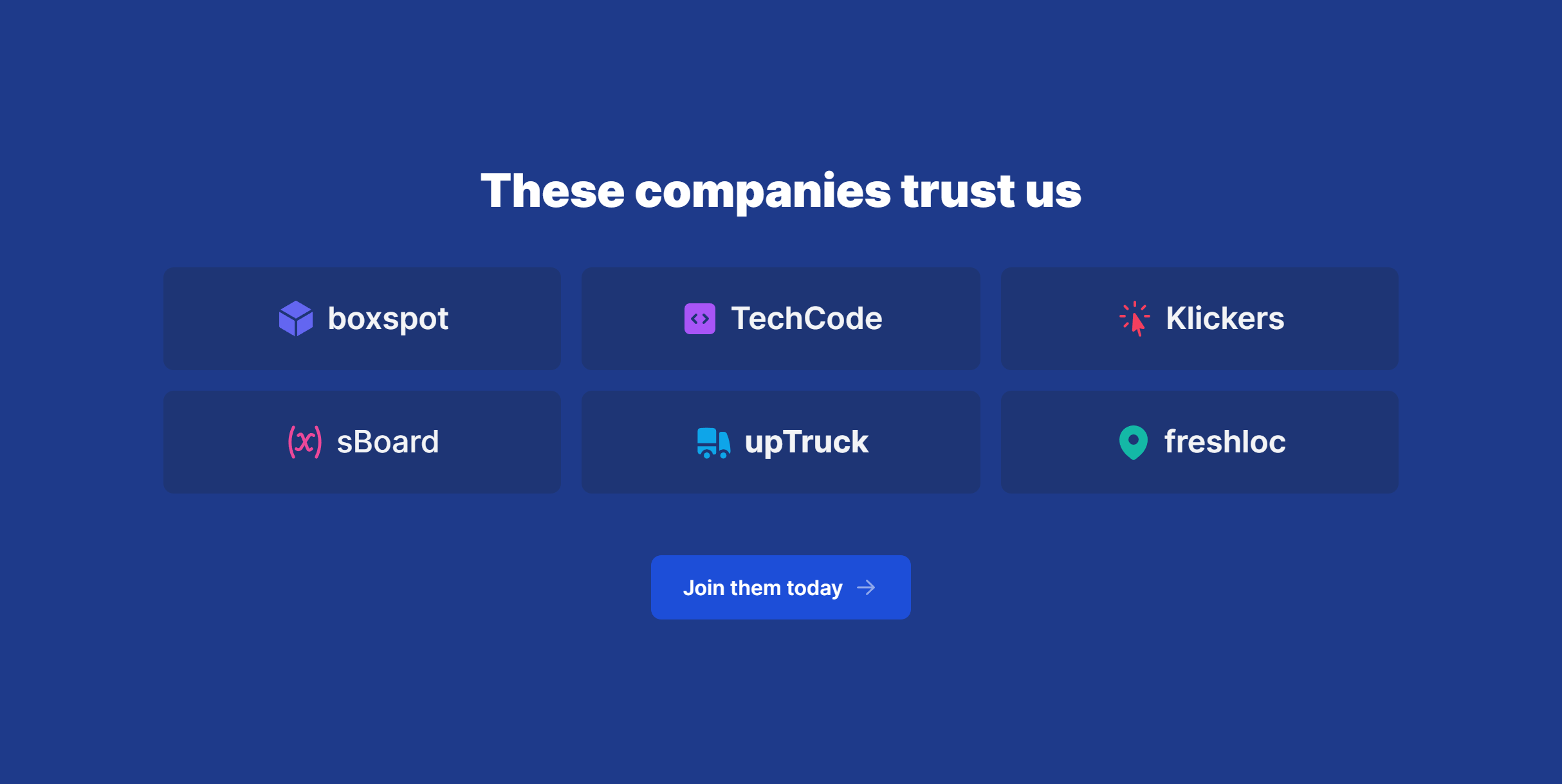
Brand Dark
Condensed with Grayscale Filter

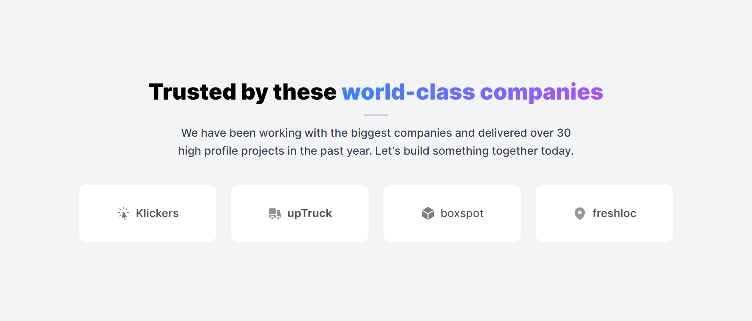
Boxed with Heading
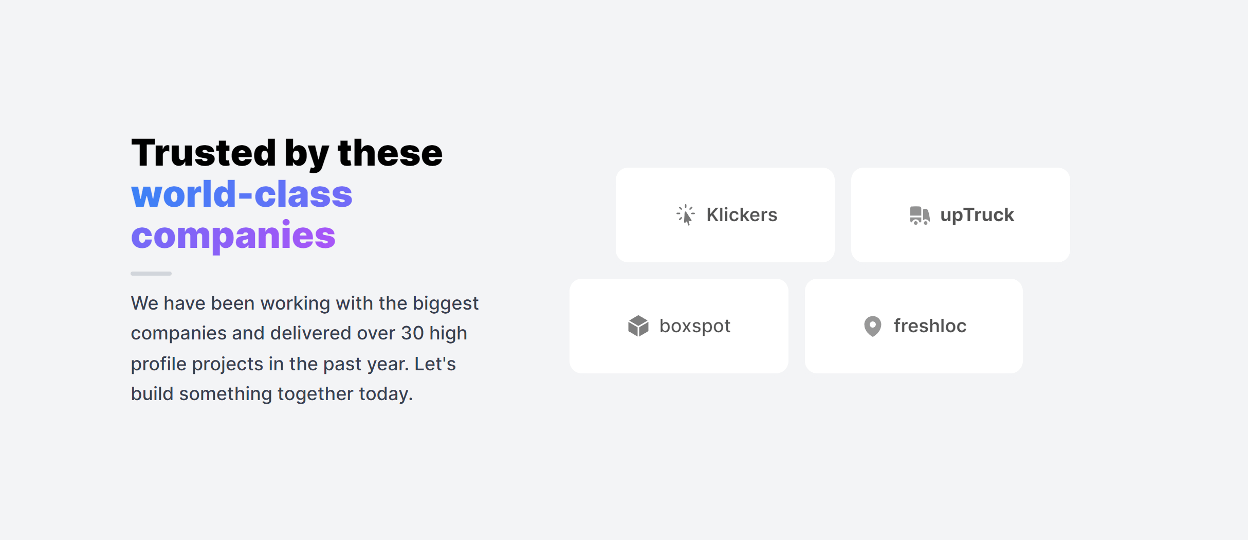
Boxed with Heading Alternate
Frequently Asked Questions
Let’s have a better look into Tailwind CSS Logos.
Should I use grayscale or color logos?
Grayscale logos keep the section visually consistent and prevent any single logo from dominating. They also look cleaner when client logos vary widely in color palette. A subtle hover effect that reveals the full-color version adds a nice interactive touch. For sections where brand recognition matters more (like a partner page), full-color logos may work better.
How many logos should I display?
Five to eight logos make a strong impression without overwhelming the section. If you have more, consider a scrolling marquee or a rotating selection. Prioritize your most recognizable clients or the logos that resonate most with your target audience. Quality matters more than quantity here.
2,000+ handcrafted snippets.
Now in your AI editor.
Build modern web apps and websites with Tailkit's huge collection of Tailwind components, templates and tools. Now available through our MCP Server.