v5.0 launch sale - limited time offer!
Tailwind CSS Tooltips
There are 6 available components in this category, preview them all!
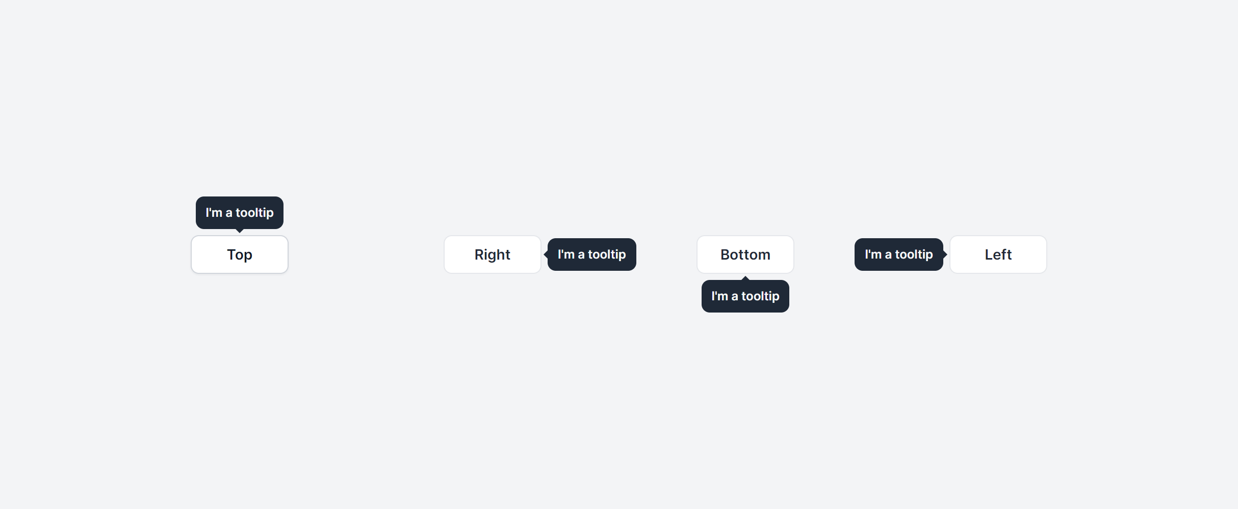
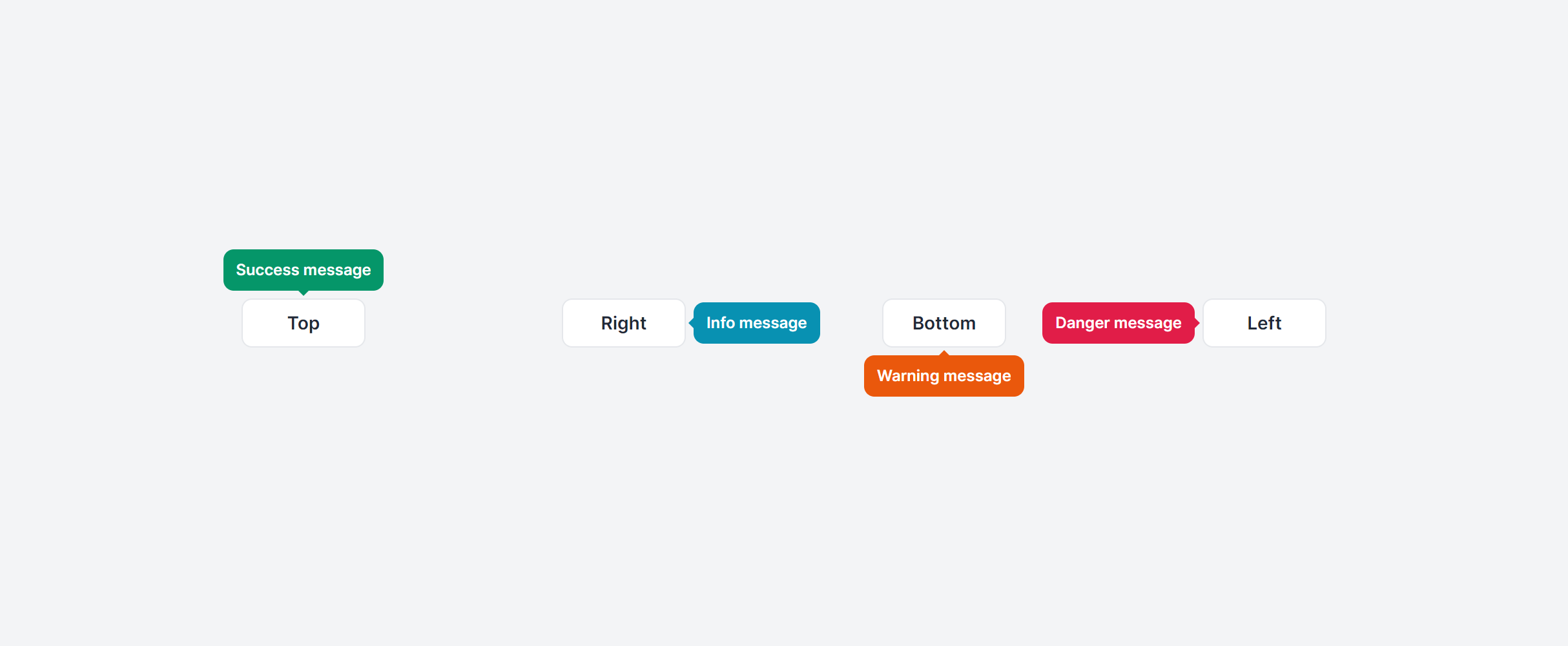
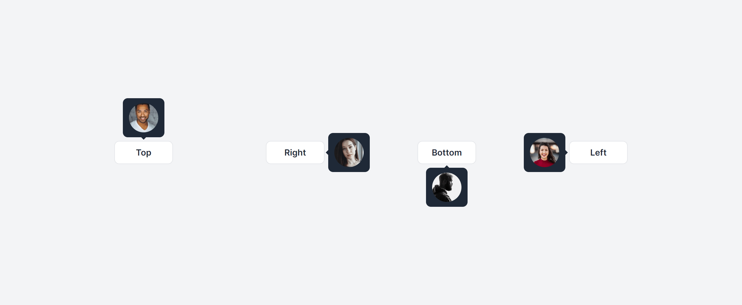
Default
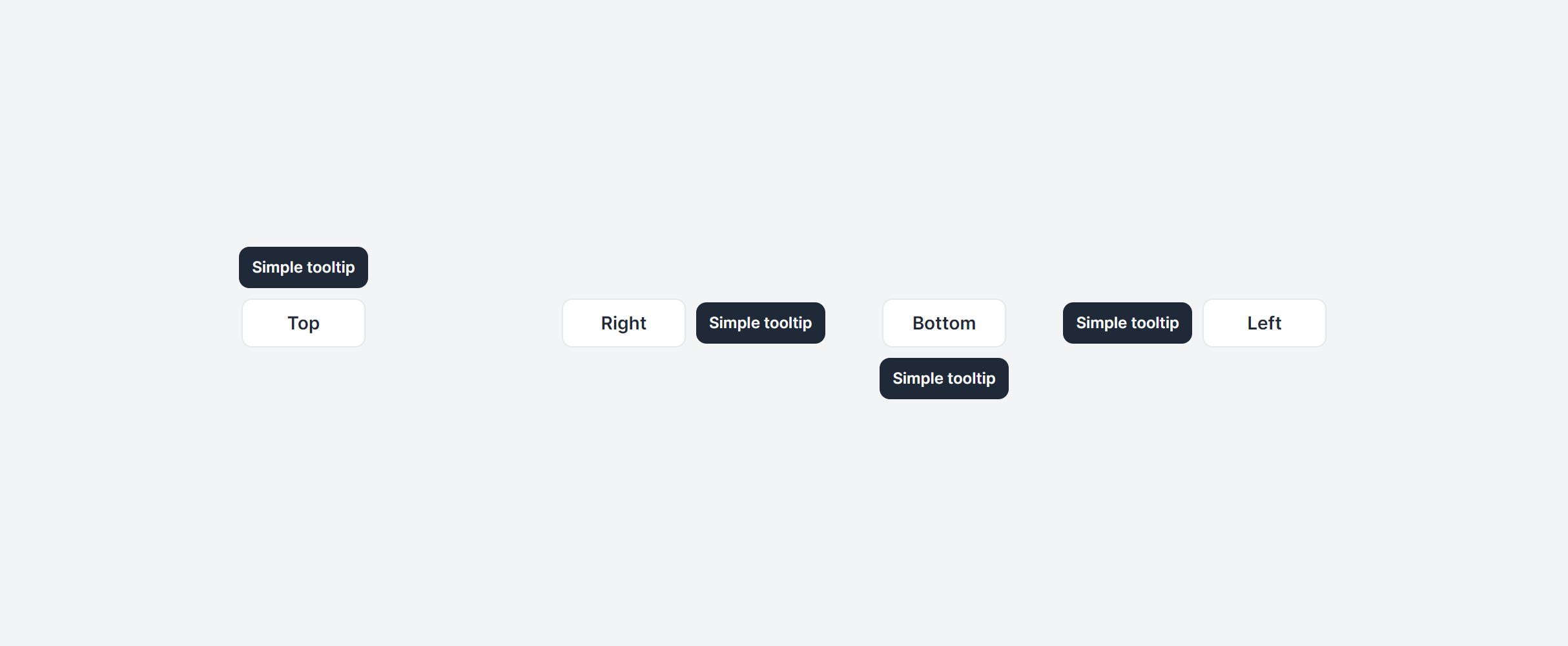
No Animation
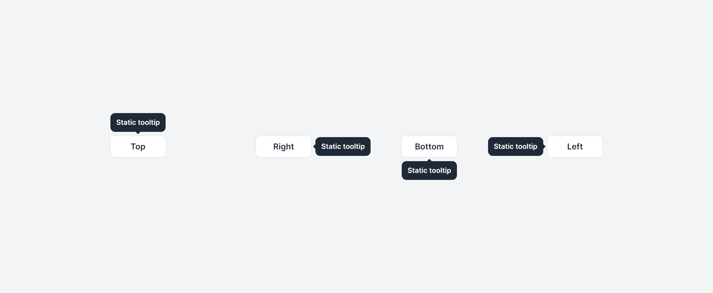
No Arrow
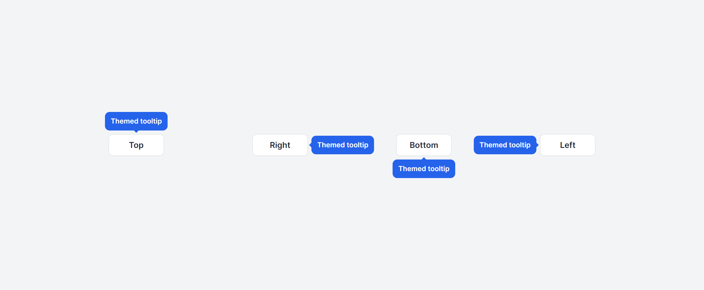
Themed
Contextual
With HTML
Frequently Asked Questions
Let’s have a better look into Tailwind CSS Tooltips.
How do tooltips work on touch devices?
Hover states don't exist on touch screens, so tooltips triggered by hover won't appear. For mobile, you can enable hover states with the @custom-variant hover (&:hover); Tailwind CSS variant in you main CSS file.
What's the difference between a tooltip and a title attribute?
The title attribute provides native browser tooltips, but you can't style them, control their timing, or guarantee consistent behavior across browsers. Custom tooltips give you full control over appearance, positioning, and animation. They also work better with screen readers when paired with proper aria-describedby attributes pointing to the tooltip content.
2,000+ handcrafted snippets.
Now in your AI editor.
Build modern web apps and websites with Tailkit's huge collection of Tailwind components, templates and tools. Now available through our MCP Server.