v5.0 launch sale - limited time offer!
Tailwind CSS Tabs
There are 11 available components in this category, preview them all!
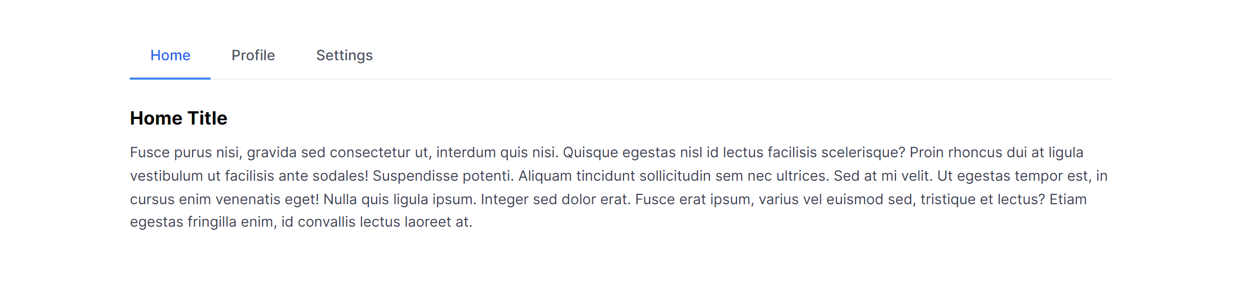
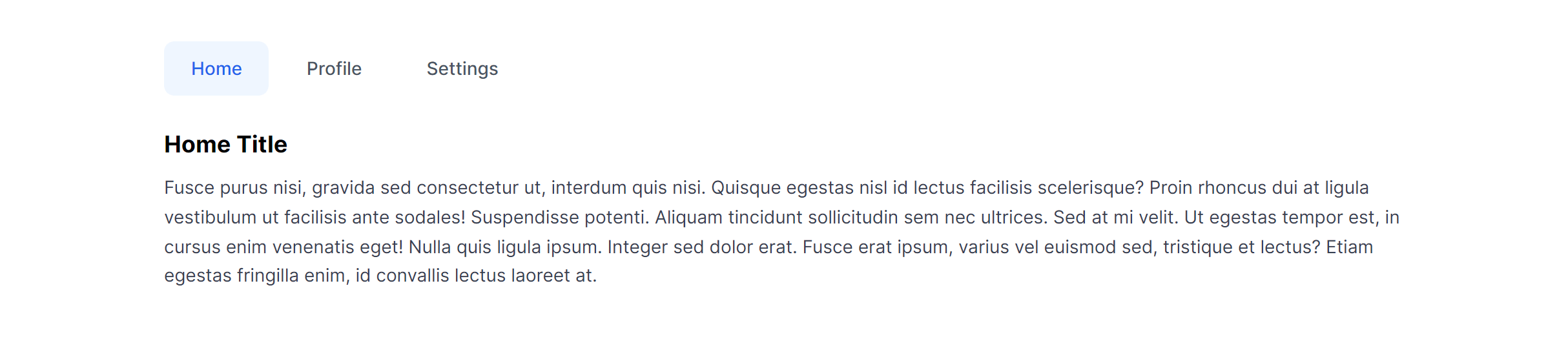
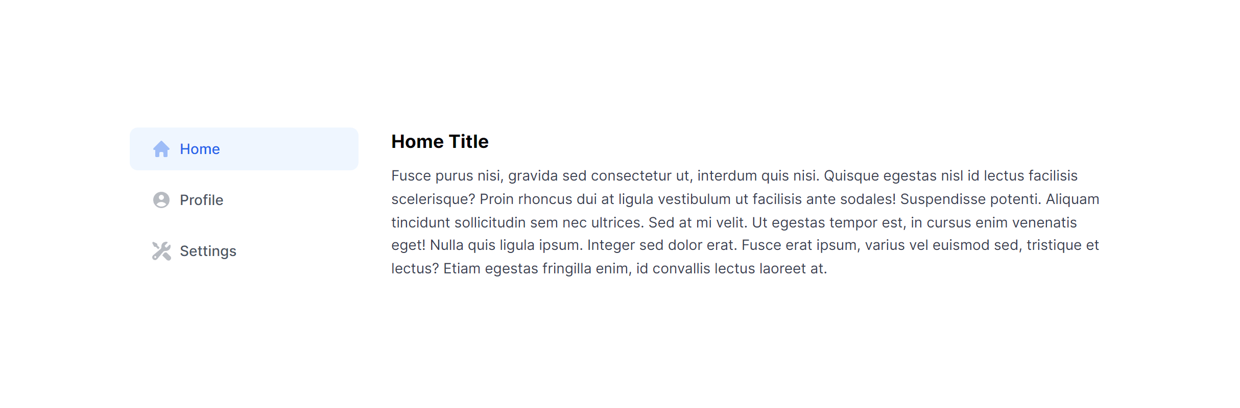
Default
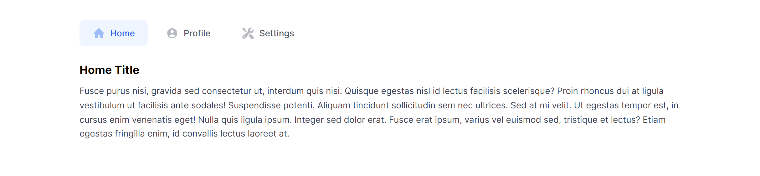
Default with Icons
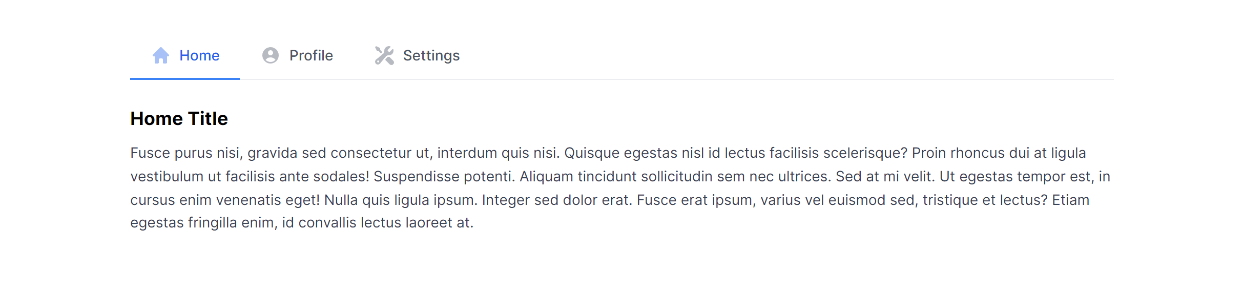
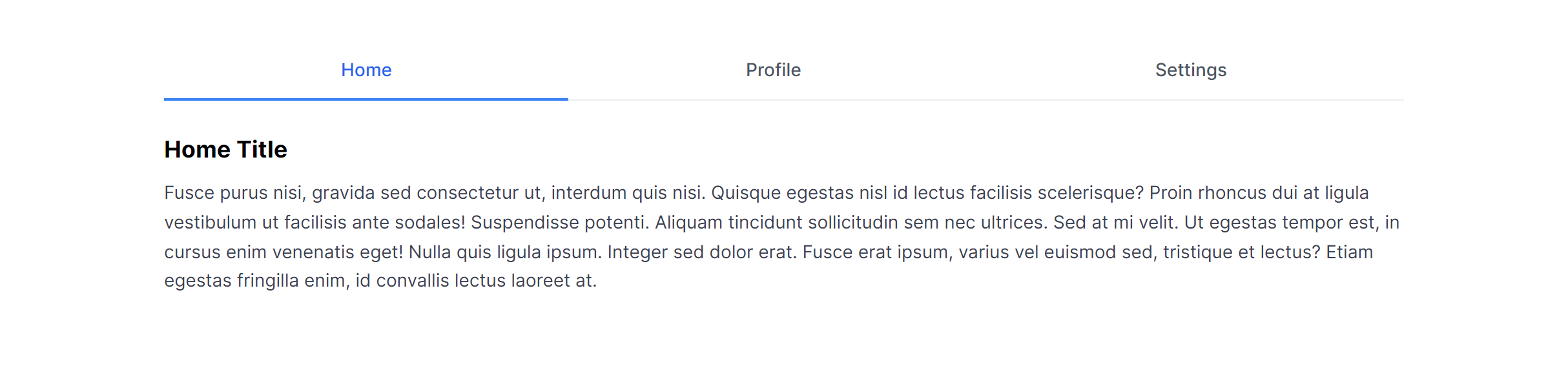
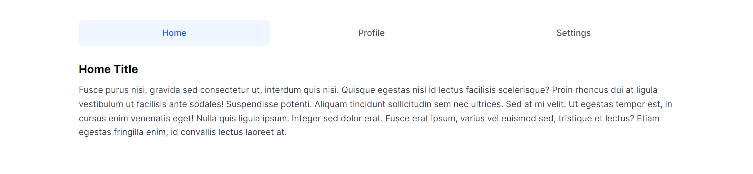
Default Justified
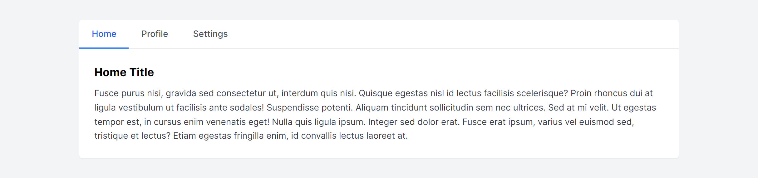
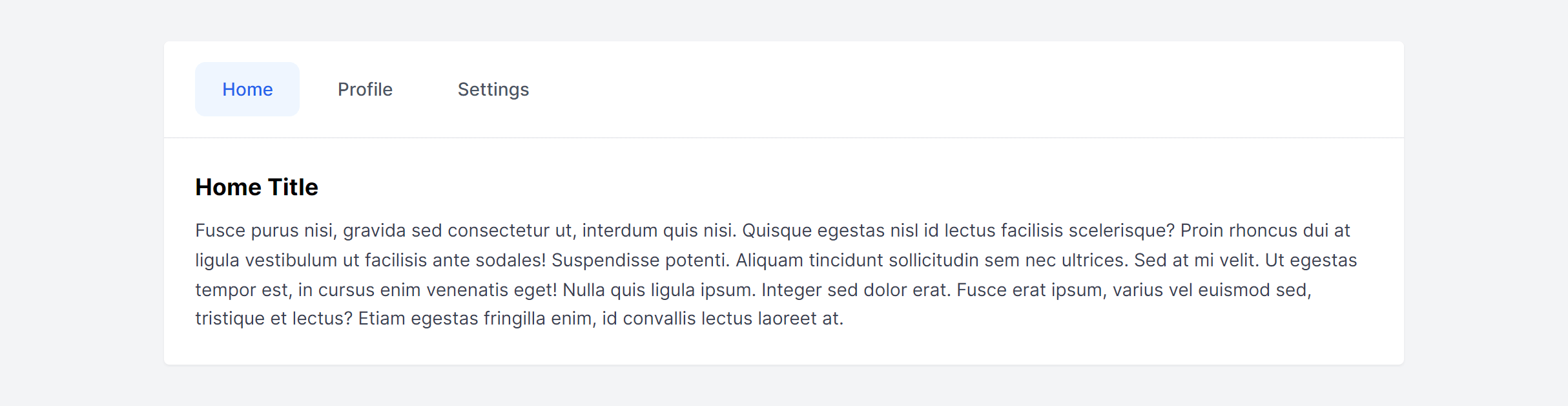
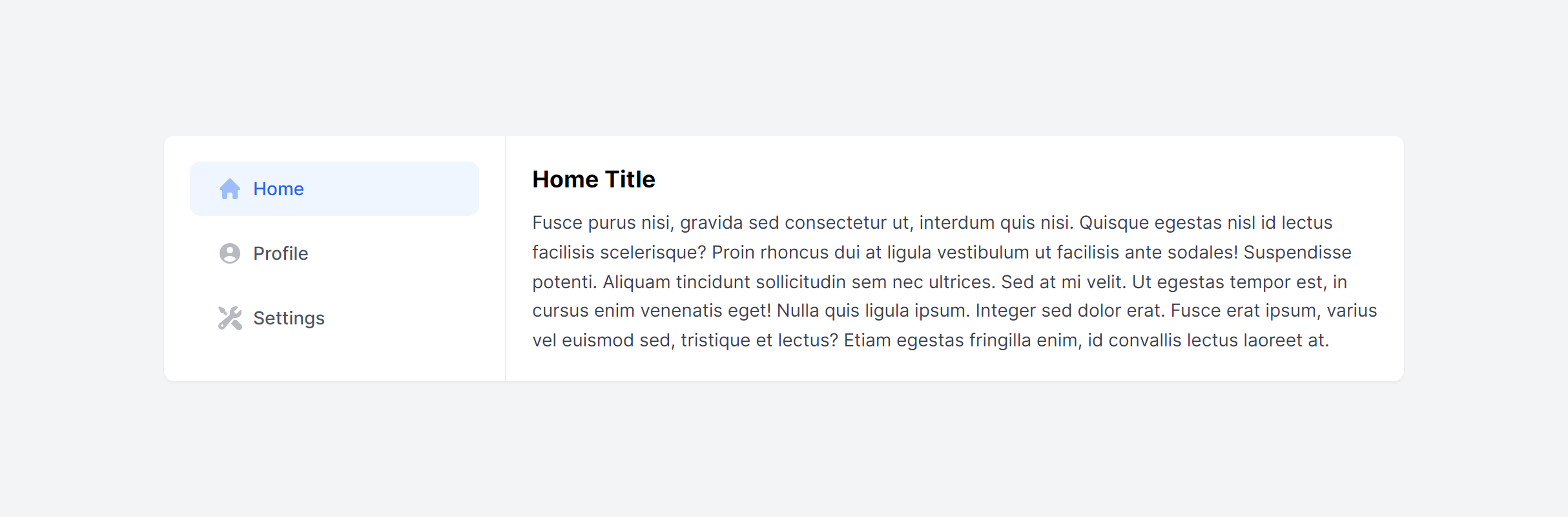
Default in Card
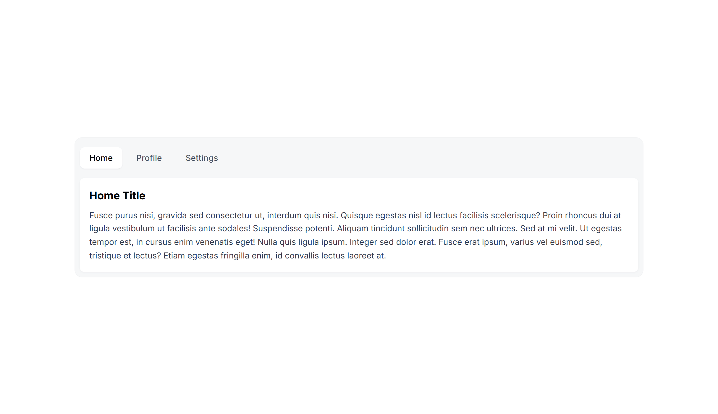
Pills
Pills with Icons
Pills Justified
Pills in Card
Pills Vertical
Pills Vertical in Card
In Card Alternate
Frequently Asked Questions
Let’s have a better look into Tailwind CSS Tabs.
Can I use tabs for URL-based navigation?
Yes, but the approach differs from client-side tabs. Each tab becomes a link to a different route or URL parameter, and the server or router determines which content to load. The visual tab component stays the same, but instead of toggling panels on the client, each tab triggers navigation. This is common for settings pages where each section has its own URL and can be bookmarked directly.
How do I handle tab overflow when there are too many tabs?
When tabs exceed the available width, you have several options: allow horizontal scrolling with overflow-x-auto and a subtle scroll indicator, collapse extra tabs into a "More" dropdown, or switch to a vertical layout on wider screens. On mobile, converting tabs to a native select dropdown handles any number of options cleanly.
2,000+ handcrafted snippets.
Now in your AI editor.
Build modern web apps and websites with Tailkit's huge collection of Tailwind components, templates and tools. Now available through our MCP Server.