Summer Sale is now on!
Tailwind CSS Notifications
There are 6 available components in this category, preview them all!
Variants
Fully responsive design
Supports dark mode
HTML code snippet
React code snippet
Vue.js code snippet
Alpine.js code snippet
JS required
Screenshot
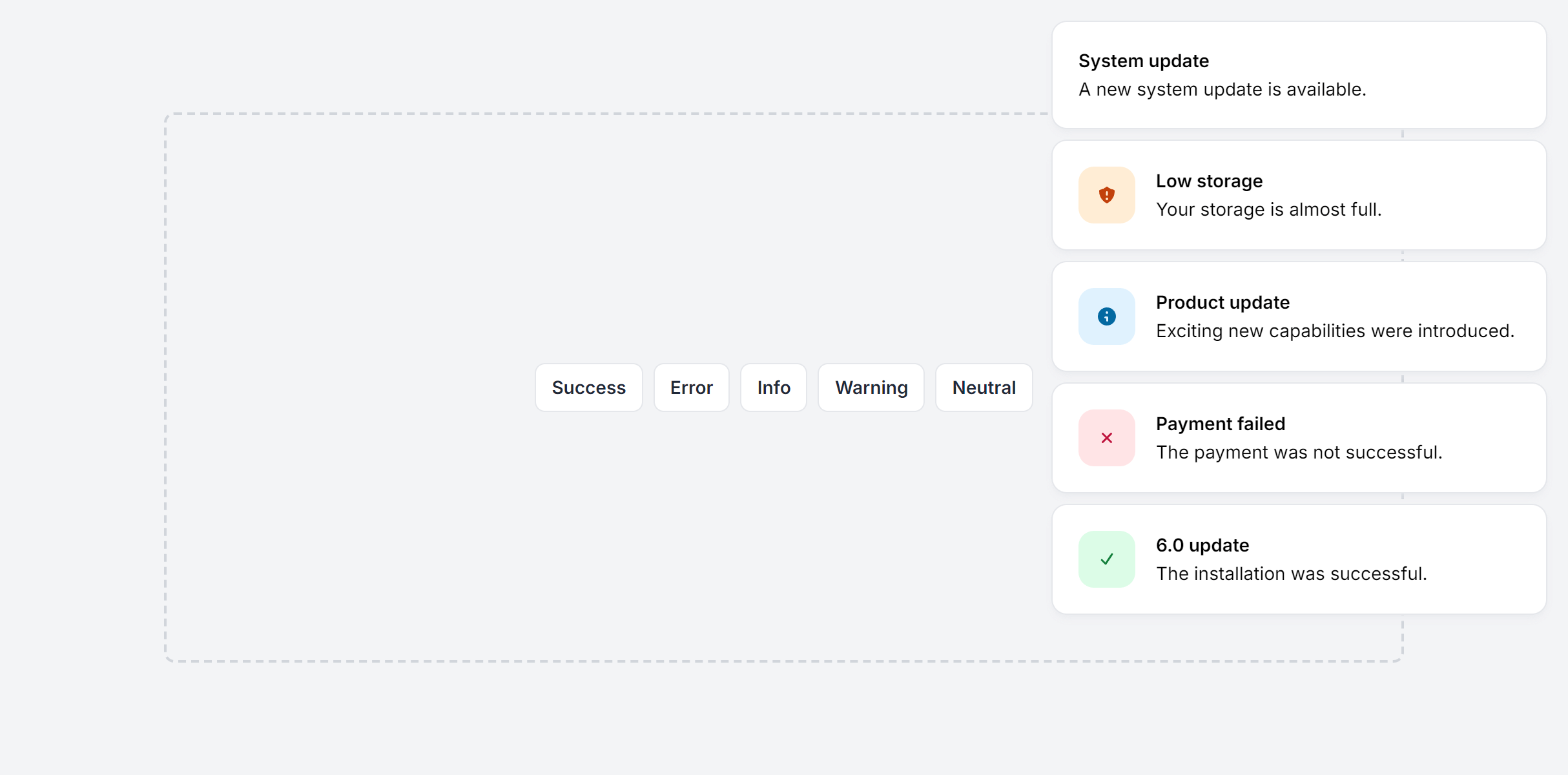
With Close Button
Fully responsive design
Supports dark mode
HTML code snippet
React code snippet
Vue.js code snippet
Alpine.js code snippet
JS required
Screenshot
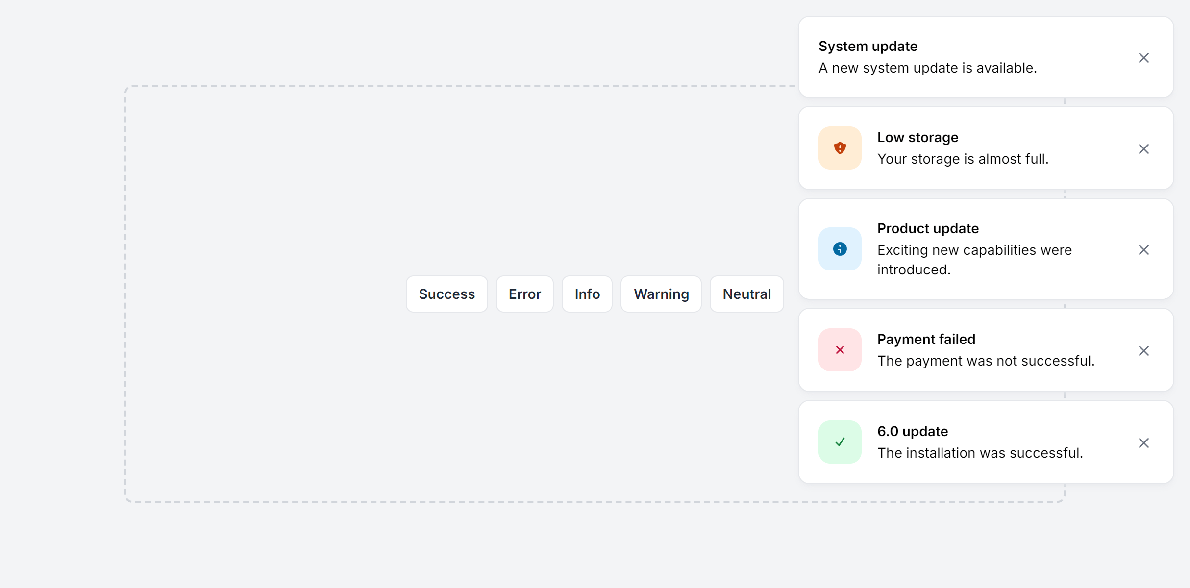
With Link
Fully responsive design
Supports dark mode
HTML code snippet
React code snippet
Vue.js code snippet
Alpine.js code snippet
JS required
Screenshot
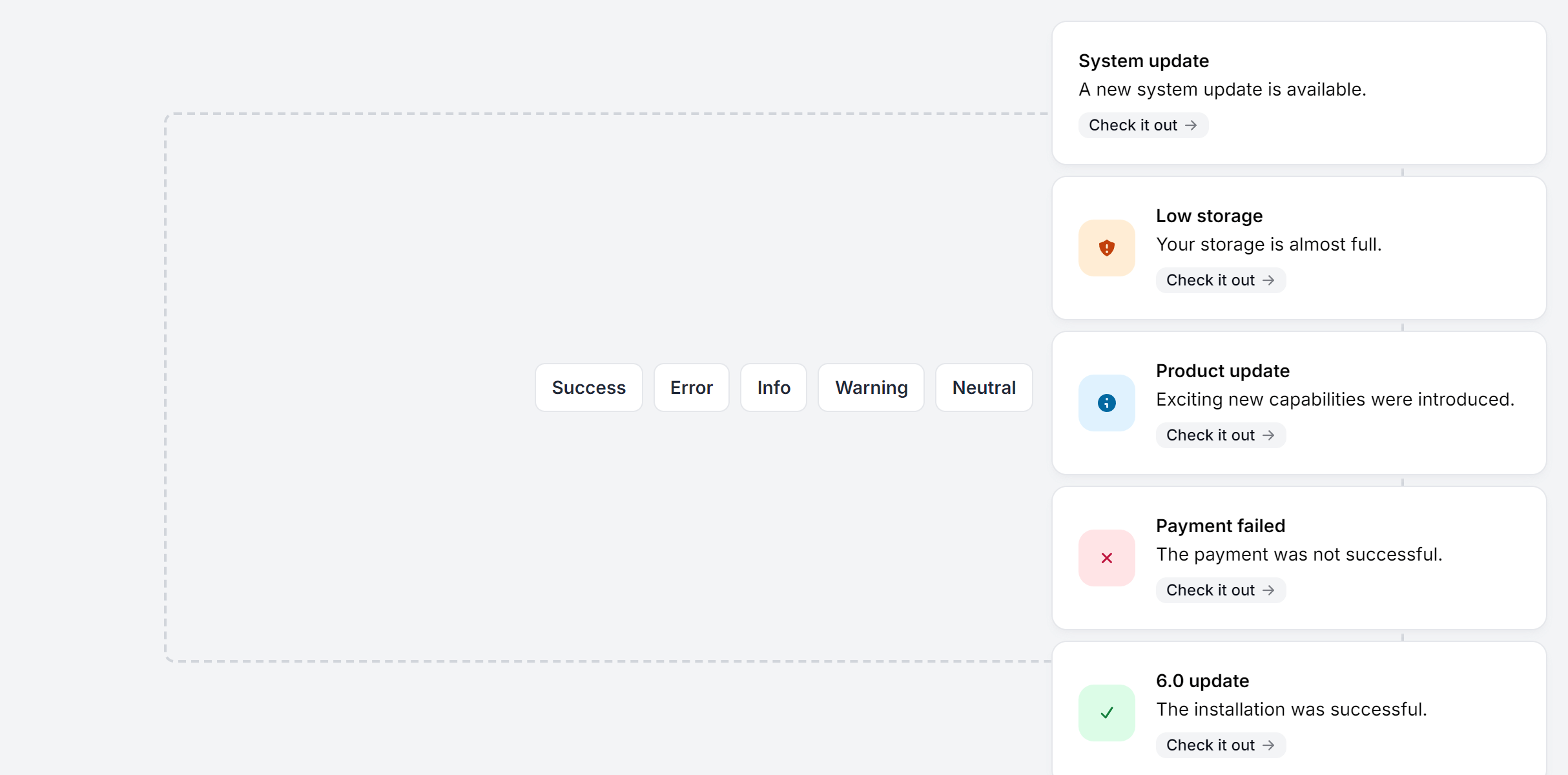
Position Top Start
Fully responsive design
Supports dark mode
HTML code snippet
React code snippet
Vue.js code snippet
Alpine.js code snippet
JS required
Screenshot
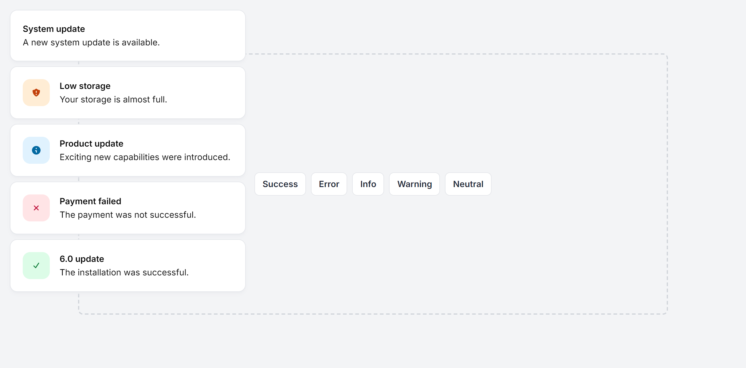
Position Bottom Start
Fully responsive design
Supports dark mode
HTML code snippet
React code snippet
Vue.js code snippet
Alpine.js code snippet
JS required
Screenshot
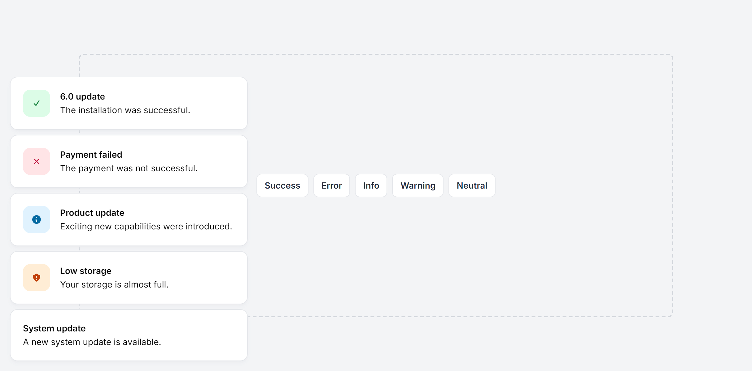
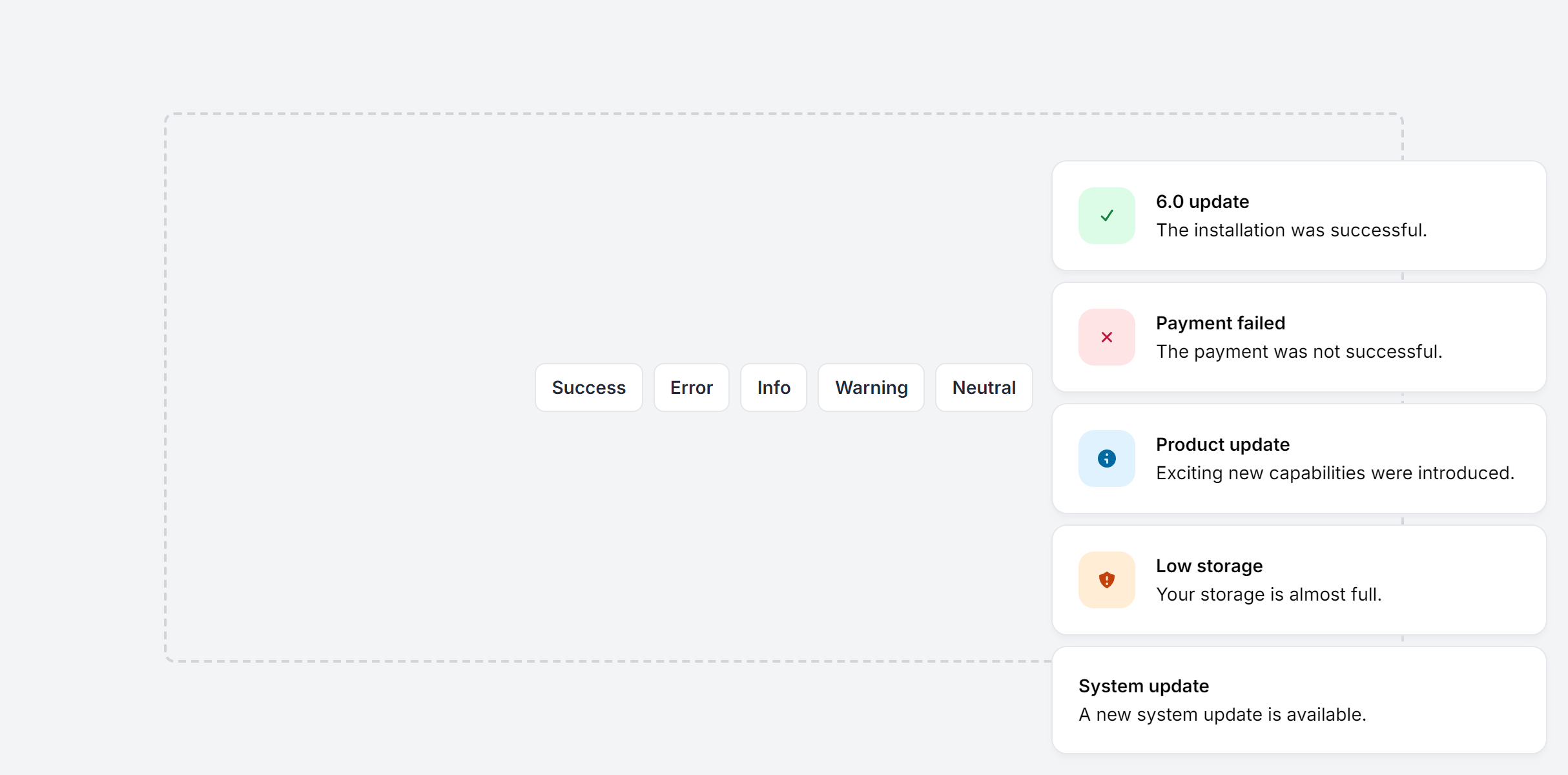
Position Bottom End
Fully responsive design
Supports dark mode
HTML code snippet
React code snippet
Vue.js code snippet
Alpine.js code snippet
JS required
Screenshot
Empower your creativity with Tailkit
1,950+ code snippets are waiting for you.
Build beautiful and super modern web applications and websites with Tailkit's huge collection of Tailwind components, templates and tools.