v5.0 launch sale - limited time offer!
Tailwind CSS Form Elements
There are 16 available components in this category, preview them all!
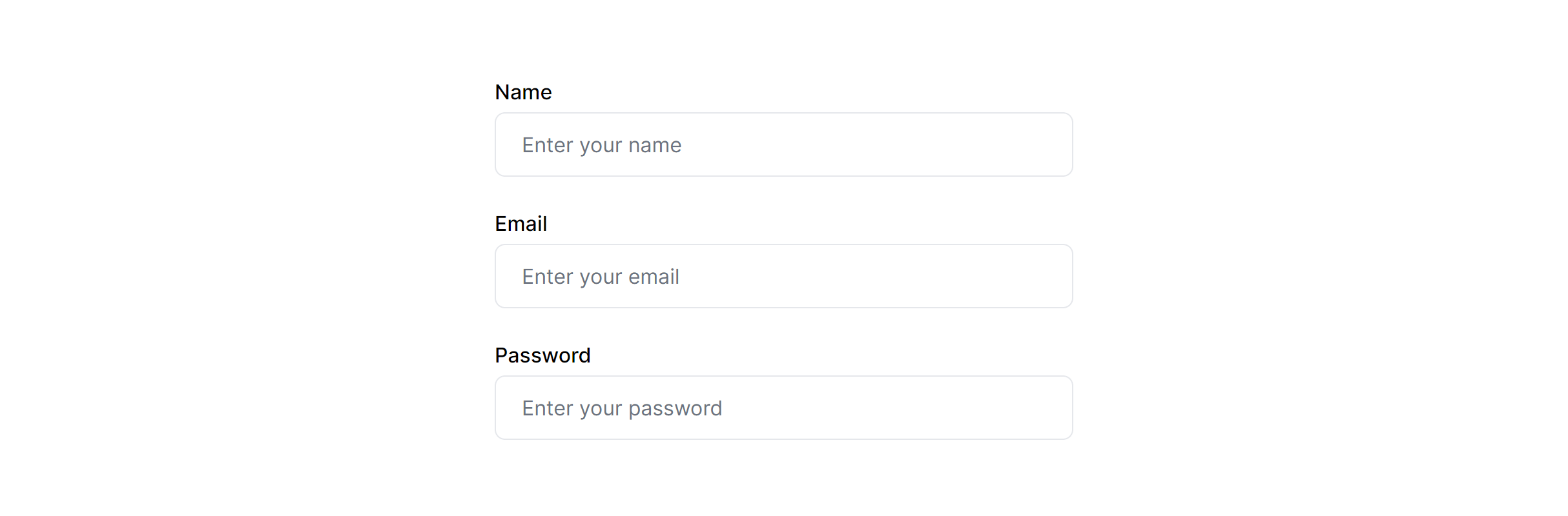
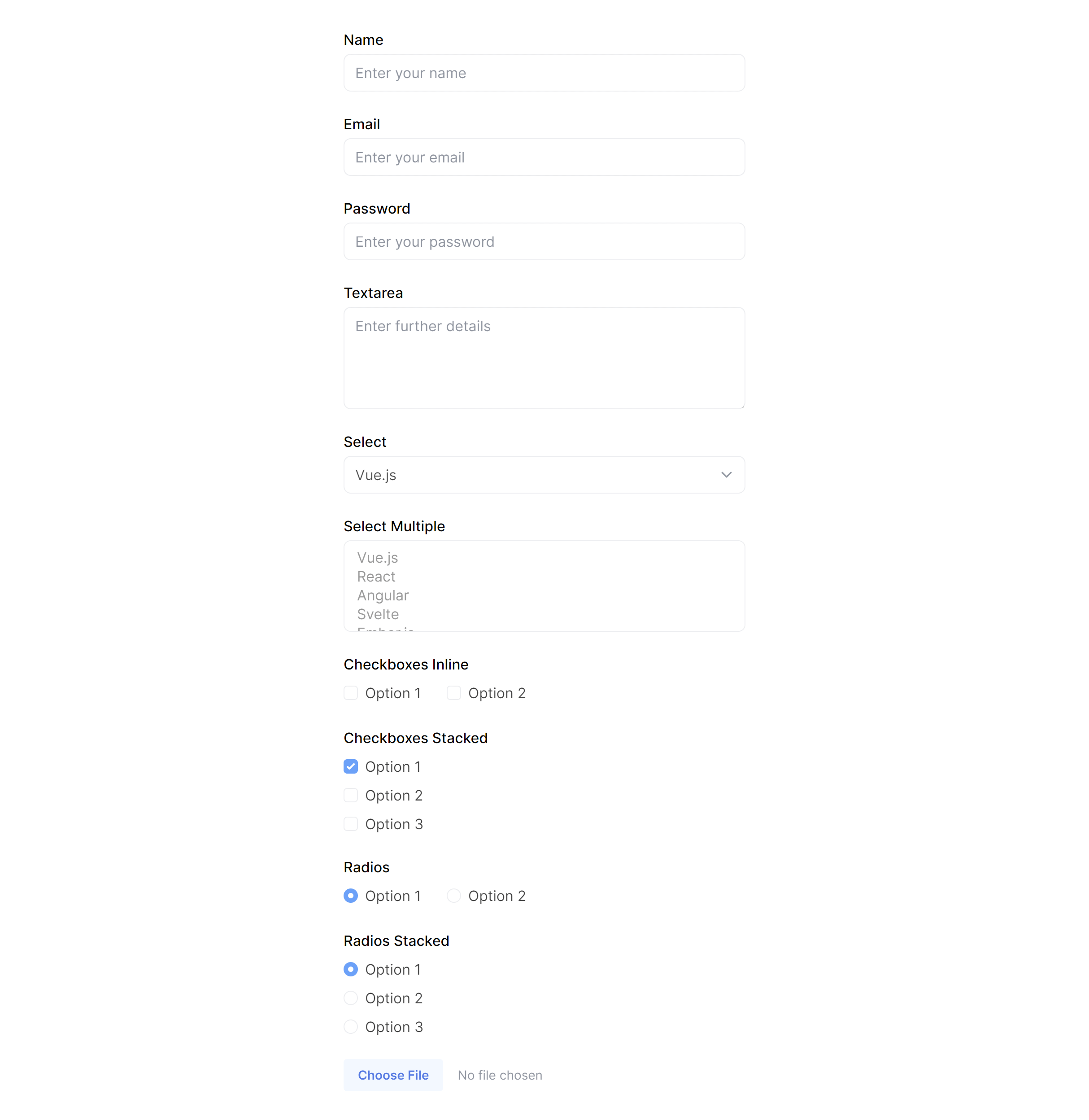
Inputs

Textarea

Select

Checkboxes

Radios

File

Input with Help

Input with Validation Error

Input with Validation Success

Small Inputs

Large Inputs
Small Textarea

Large Textarea

Small Select

Large Select

Disabled
Frequently Asked Questions
Let’s have a better look into Tailwind CSS Form Elements.
How do I style validation error states on a Tailwind CSS form input?
Apply border-red-500 (or your error color) to the input and display an error message below it in matching text. Add aria-describedby on the input pointing to the error message's ID. Some variants include an error icon inside the input for extra visual emphasis. Clear the error styling dynamically as the user corrects the value.
What is the best way to handle a form with many fields?
Break the form into logical sections with headings and visual separators. Group related fields together (personal info, address, payment). For very long forms, consider a multi-step wizard where each step handles one section. Use two-column layouts on desktop to reduce vertical scrolling, but always collapse to single-column on mobile. The form layout components in this library provide ready-made structures for all of these patterns.

2,000+ handcrafted snippets.
Now in your AI editor.
Build modern web apps and websites with Tailkit's huge collection of Tailwind components, templates and tools. Now available through our MCP Server.