v5.0 launch sale - limited time offer!
Tailwind CSS Cards In Grid
There are 5 available components in this category, preview them all!
People

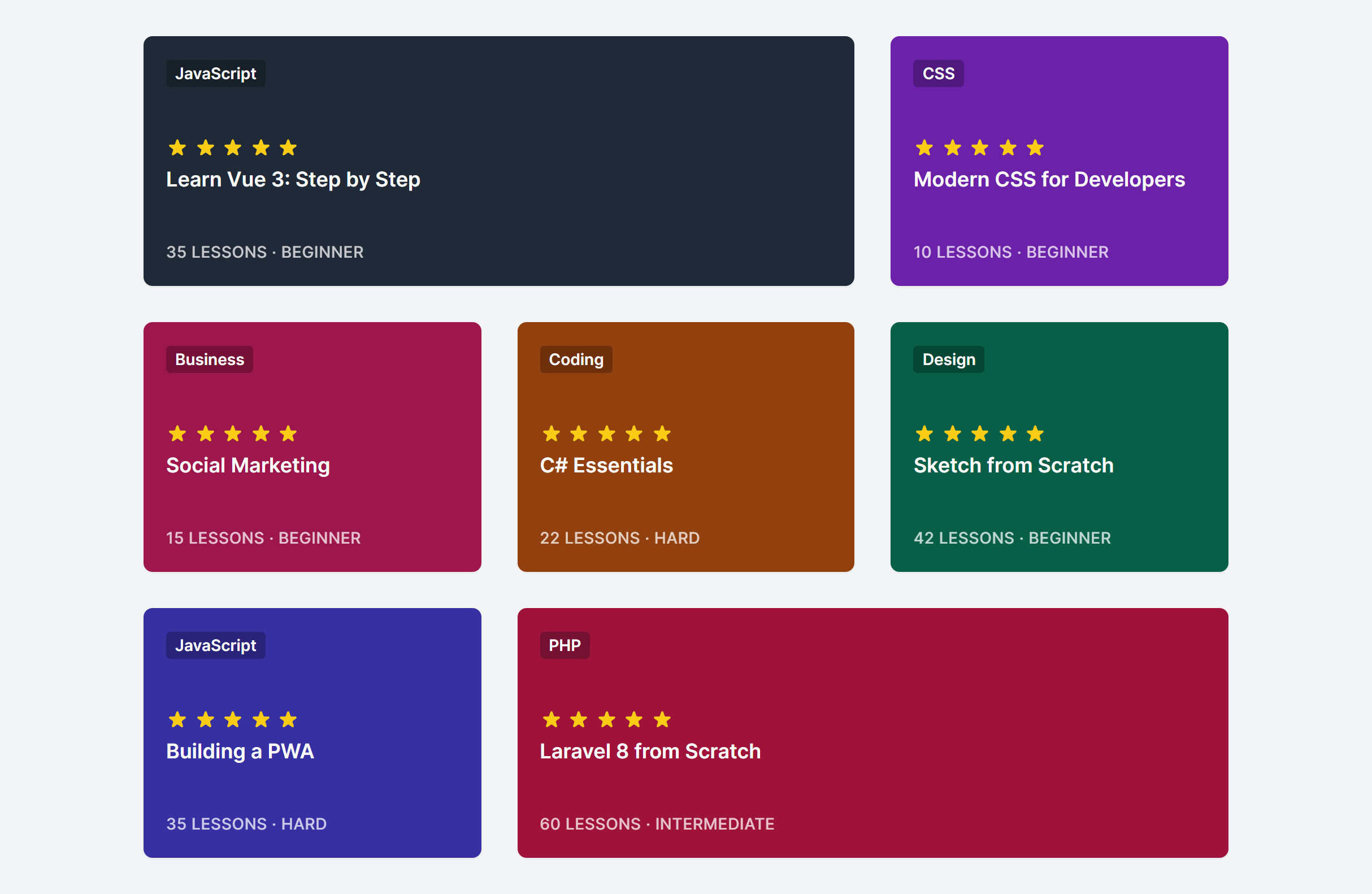
Courses
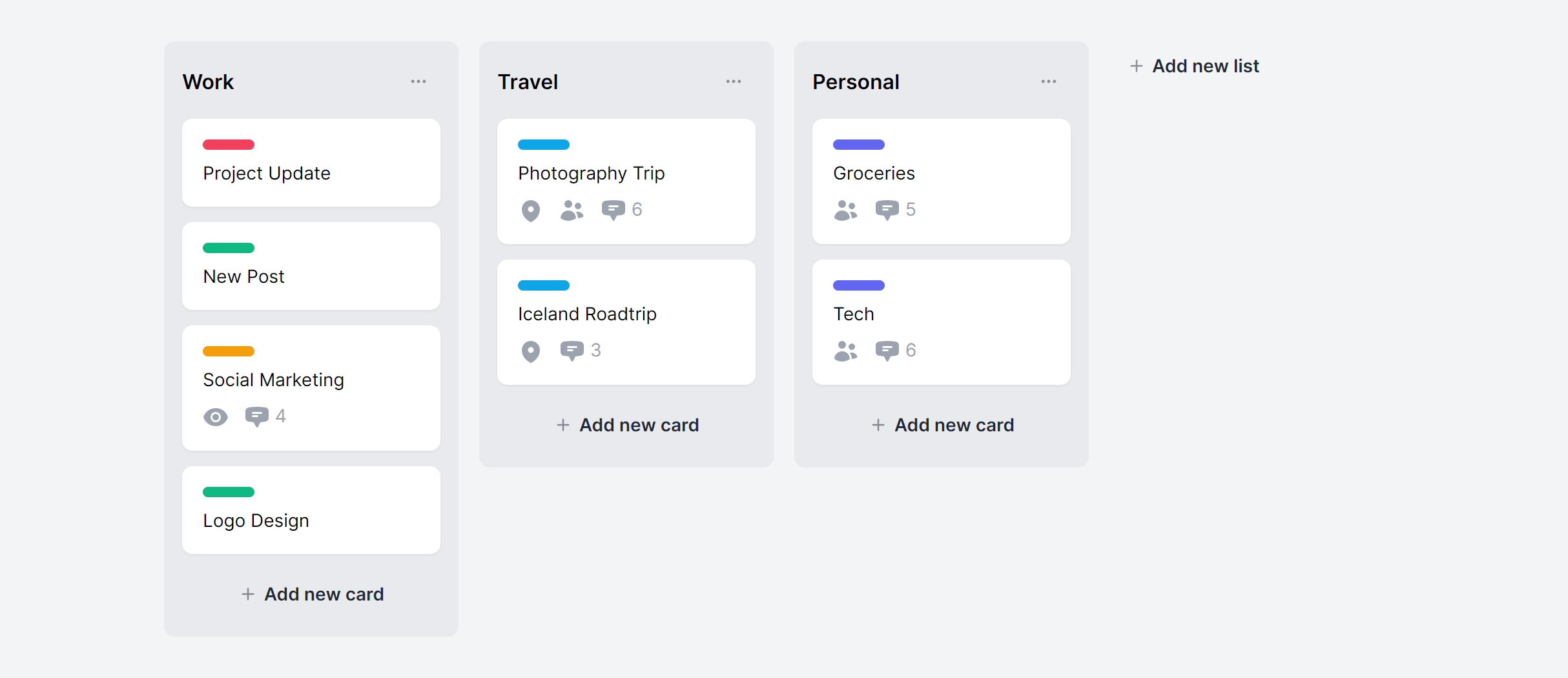
Projects
With Placeholders
Credit Cards

Frequently Asked Questions
Let’s have a better look into Tailwind CSS Cards In Grid.
How do I keep cards at the same height when content length varies?
The key is making each card a flex column and setting the body section to flex-1 (or grow). This pushes footers to the bottom regardless of how much body content exists. Avoid setting fixed heights, as that leads to overflow problems. If you're using CSS Grid, subgrid can align internal card sections across an entire row.
How do I create a featured card that is larger than the others?
Use col-span-2 or row-span-2 on the featured card. CSS Grid handles mixed sizes naturally as long as your grid has enough columns to accommodate the span. A common pattern: a 3-column grid where the first card spans 2 columns, creating a visual hierarchy that draws attention to the primary item.
What column count works best for card grids?
It depends on the content density. Text-heavy cards (blog posts, product descriptions) work best in 2 or 3 columns. Compact items (small product tiles, stats) can go to 4 or more. Test at each breakpoint with real content rather than placeholder text, since that's where layout problems tend to show up.

2,000+ handcrafted snippets.
Now in your AI editor.
Build modern web apps and websites with Tailkit's huge collection of Tailwind components, templates and tools. Now available through our MCP Server.