Summer Sale is now on!
Tailwind CSS Cards
There are 9 available components in this category, preview them all!
Simple
Fully responsive design
Supports dark mode
HTML code snippet
React code snippet
Vue.js code snippet
Screenshot

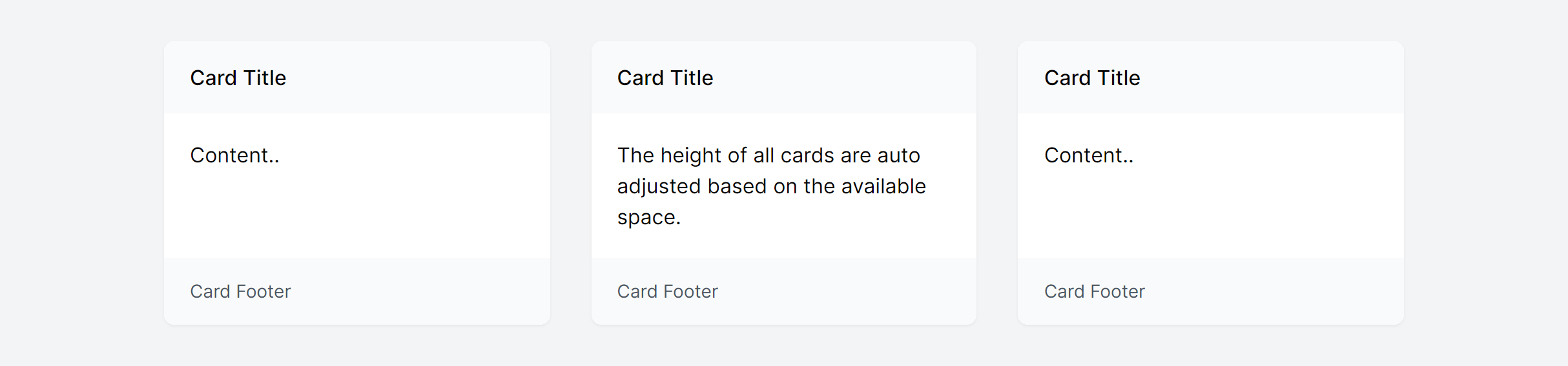
Simple in Grid
Fully responsive design
Supports dark mode
HTML code snippet
React code snippet
Vue.js code snippet
Screenshot
Simple with Actions
Fully responsive design
Supports dark mode
HTML code snippet
React code snippet
Vue.js code snippet
Screenshot

User
Fully responsive design
Supports dark mode
HTML code snippet
React code snippet
Vue.js code snippet
Screenshot

Author
Fully responsive design
Supports dark mode
HTML code snippet
React code snippet
Vue.js code snippet
Screenshot

Story
Fully responsive design
Supports dark mode
Supports color editor
HTML code snippet
React code snippet
Vue.js code snippet
Screenshot

Product
Fully responsive design
Supports dark mode
Supports color editor
HTML code snippet
React code snippet
Vue.js code snippet
Screenshot

User with Info
Fully responsive design
Supports dark mode
HTML code snippet
React code snippet
Vue.js code snippet
Screenshot

Apartment
Fully responsive design
Supports dark mode
Supports color editor
HTML code snippet
React code snippet
Vue.js code snippet
Screenshot


It's time to finish that side project
1,950+ code snippets are waiting for you.
Build beautiful and super modern web applications and websites with Tailkit's huge collection of Tailwind components, templates and tools.